Executive Overview
To position VACALI as a disruptive, premium competitor in a saturated Ready-To-Drink (RTD) market, we developed a highly scalable packaging architecture across multiple formats and SKUs. The strategic objective was to look beyond flat visual communication and leverage sensory-driven design to command premium shelf placement, increase consumer hand-to-brand interaction, and ensure absolute visual consistency across a complex manufacturing supply chain.
Multi-Sensory Brand Architecture
We engineered a tactile brand experience that transforms consumer interaction at the point of sale. By strategically integrating custom grit varnishes alongside high-build haptic logo coatings, we added tactile contrast that physically reinforces the brand’s premium positioning during consumer handling. The design leverages physical touch to deepen brand recall and elevate shelf presence far beyond traditional, flat-printed labels.
We engineered a tactile brand experience that transforms consumer interaction at the point of sale. By strategically integrating custom grit varnishes alongside high-build haptic logo coatings, we added tactile contrast that physically reinforces the brand’s premium positioning during consumer handling. The design leverages physical touch to deepen brand recall and elevate shelf presence far beyond traditional, flat-printed labels.
Cross-Functional Manufacturing & Vendor Orchestration
To execute this complex visual system smoothly across a diverse multi-SKU product line, I directed close cross-functional collaboration with manufacturing vendors and packaging engineers. This leadership focus included:
To execute this complex visual system smoothly across a diverse multi-SKU product line, I directed close cross-functional collaboration with manufacturing vendors and packaging engineers. This leadership focus included:
Precision Asset Management: Overseeing the development and alignment of dedicated specialty printing plates to guarantee flawless tactile registration across varying materials.
Eco-Conscious Integration: Orchestrating the design of a concealed vertical recycling perforation on the shrink sleeve, seamlessly blending functional modern sustainability requirements with a premium full-wrap brand aesthetic.
Systemized Carton Cohesion: Extending the proprietary tactile finishes into the secondary outer-carton infrastructure, establishing a unified, high-end retail presentation ecosystem from single-serve cans to bulk packaging.
Extended Carton Finishing System
The outer cartons continue the tactile experience through matching grit and raised varnish applications, creating consistency between the primary packaging and retail presentation system.
The outer cartons continue the tactile experience through matching grit and raised varnish applications, creating consistency between the primary packaging and retail presentation system.
The result is a dynamic and highly tactile packaging system that blends premium aesthetics, production functionality, and physical interaction into a cohesive brand experience engineered for today’s modern RTD and lighter liquor market.
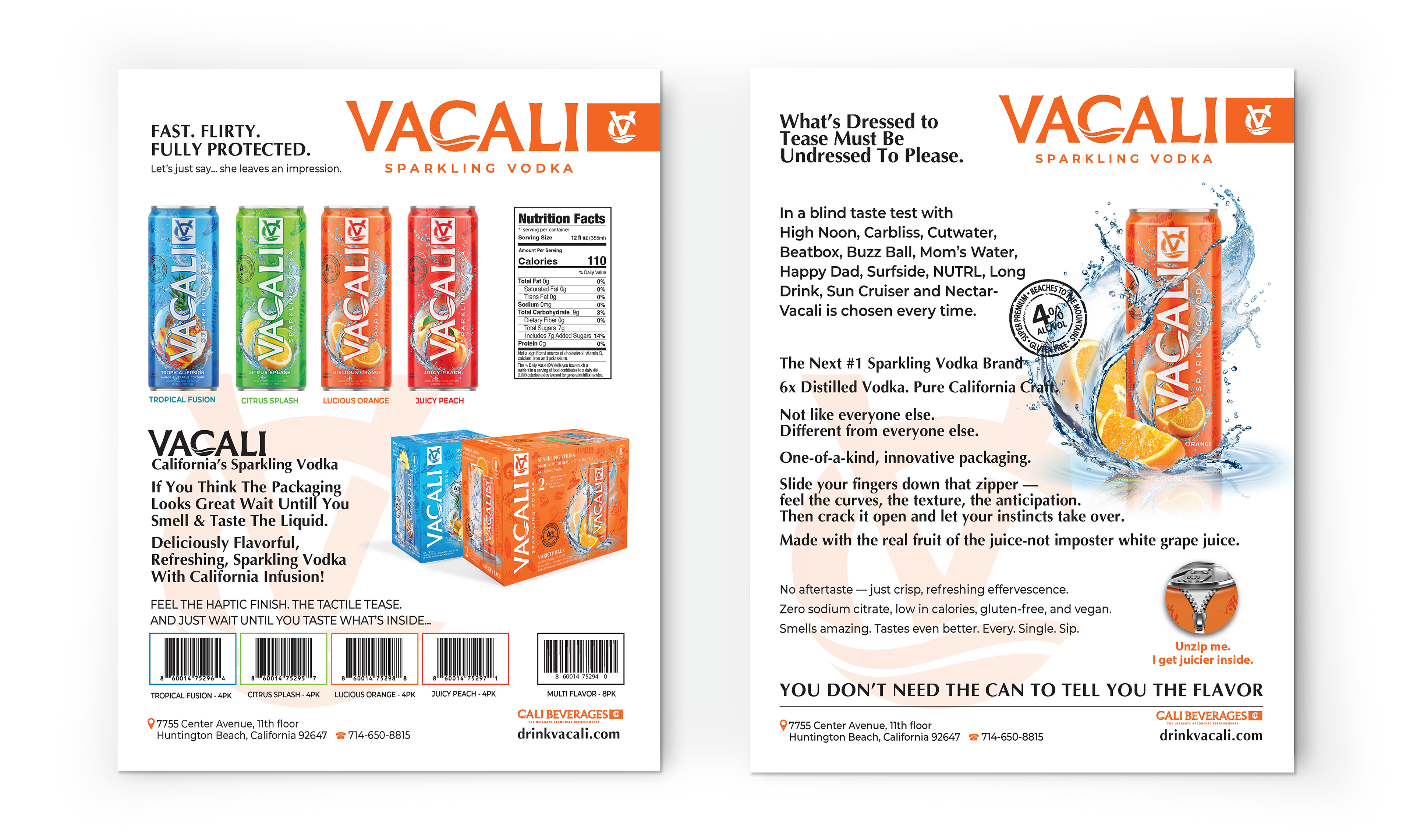
Custom Grit Varnish Finish
The emblem elements feature a specialty grit coating engineered to create a subtle sandpaper-like texture. This tactile finish adds physical depth, contrast, and a rugged premium feel that enhances shelf presence and consumer interaction.
The emblem elements feature a specialty grit coating engineered to create a subtle sandpaper-like texture. This tactile finish adds physical depth, contrast, and a rugged premium feel that enhances shelf presence and consumer interaction.
Raised Haptic Logo Varnish
The VACALI logo utilizes a raised tactile varnish application, creating a smooth dimensional surface that consumers can physically feel when handling the product. The elevated finish reinforces the premium positioning of the brand through touch as well as visual impact.
The VACALI logo utilizes a raised tactile varnish application, creating a smooth dimensional surface that consumers can physically feel when handling the product. The elevated finish reinforces the premium positioning of the brand through touch as well as visual impact.
Dedicated Specialty Printing Plates
Both the grit texture and raised varnish required separate custom production plates during manufacturing. Precise plate registration and production coordination were necessary to maintain consistency, alignment, and tactile quality across all SKUs and packaging components.
Both the grit texture and raised varnish required separate custom production plates during manufacturing. Precise plate registration and production coordination were necessary to maintain consistency, alignment, and tactile quality across all SKUs and packaging components.
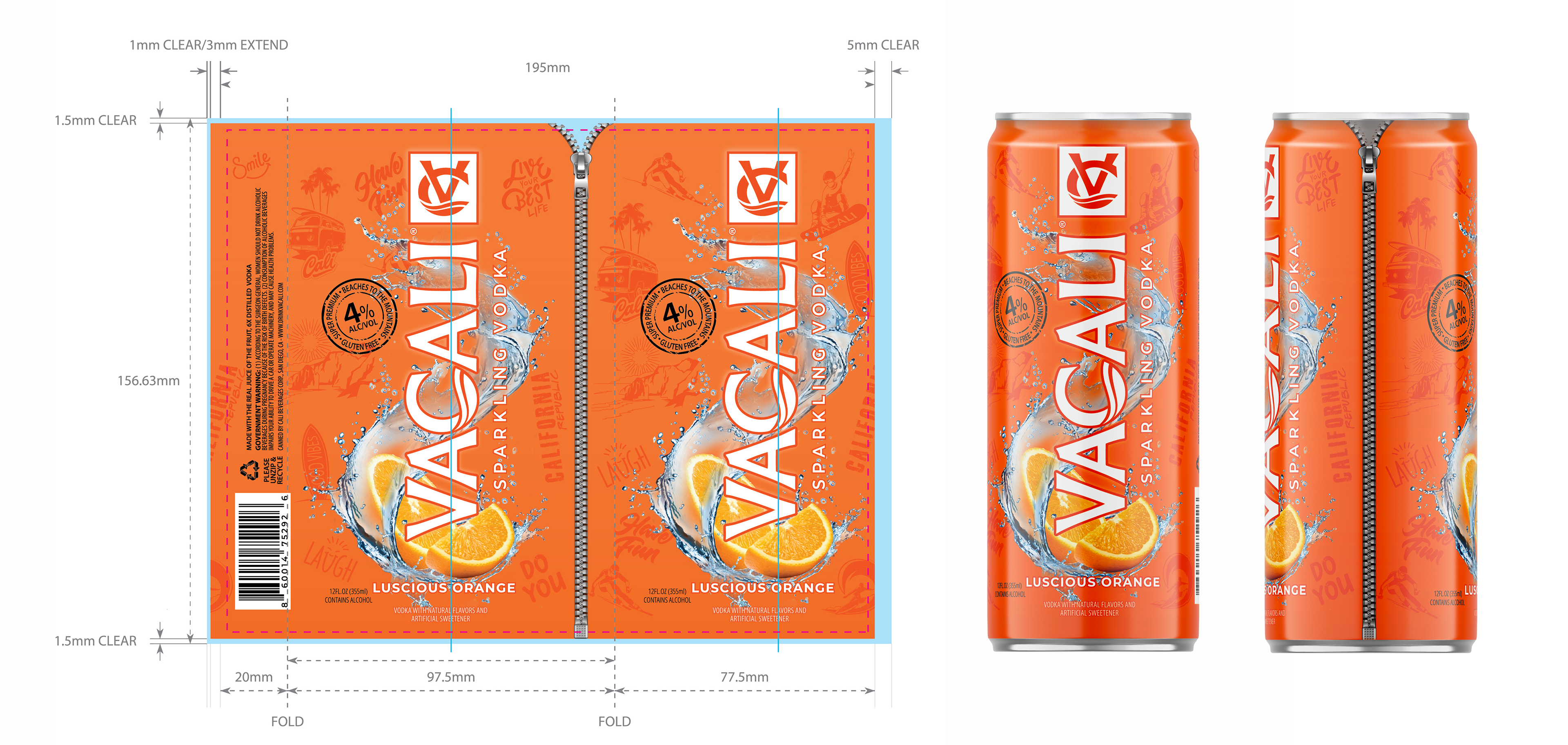
Integrated Recycling Perforation
The shrink sleeve includes a vertical perforation concealed along the backside zipper seam, allowing consumers to remove the label prior to recycling while maintaining the integrity of the seamless full-wrap design.
The shrink sleeve includes a vertical perforation concealed along the backside zipper seam, allowing consumers to remove the label prior to recycling while maintaining the integrity of the seamless full-wrap design.

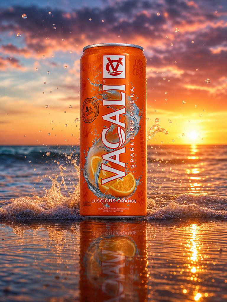
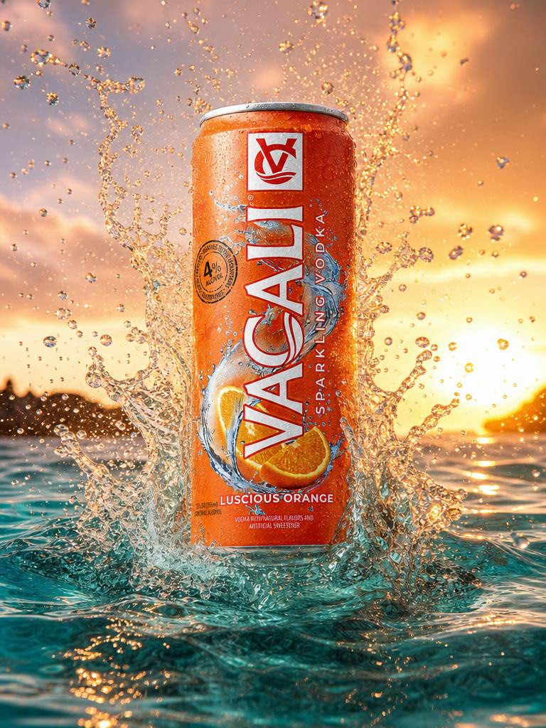
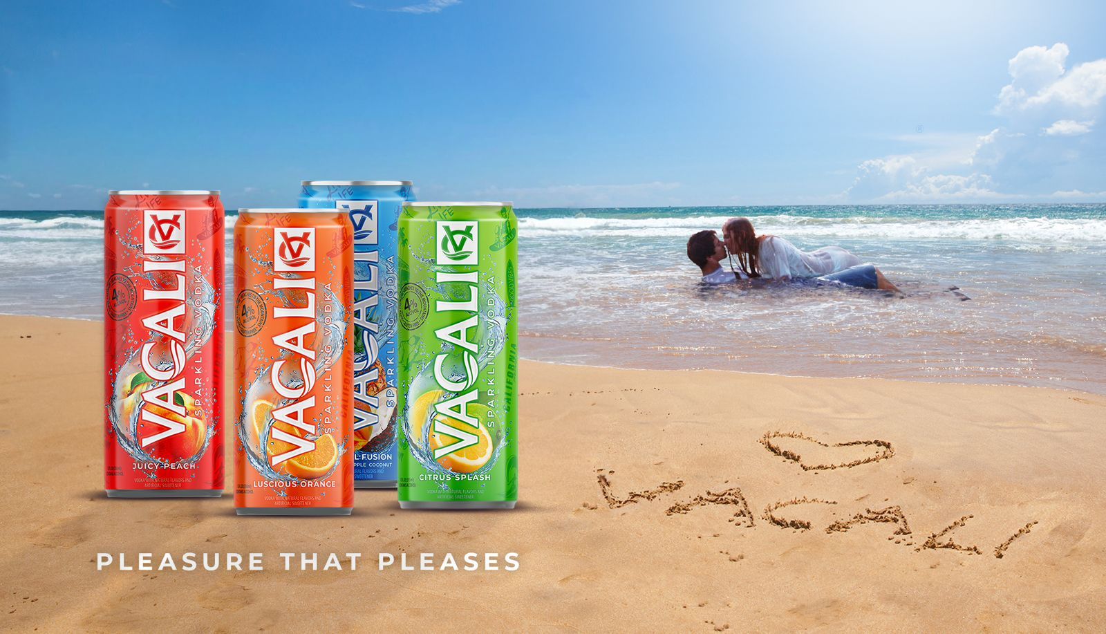
Brand Energy & Consumer Appeal
Secondary visuals emphasize product experience and refreshment, reinforcing the energy and flavor-forward identity of the brand.
Starting Point (Original Design-below)
The brand began with an initial can concept and label direction that established key visual elements, including color differentiation and core brand identity.
However, the design required significant refinement to support:
Production constraints
Multi-SKU consistency
Packaging expansion beyond single cans
The Challenge
While the brand possessed a strong initial creative concept, it lacked the rigorous technical architecture required for large-scale, multi-SKU commercial manufacturing. The executive hurdle was transforming the abstract artwork into a production-ready visual system. This required mitigating substantial manufacturing risks—such as seam distortion on cylindrical shrink sleeves—while establishing absolute brand consistency across diverse packaging formats including cans, multi-pack cartons, and retail transit trays.
The Solution & System Architecture
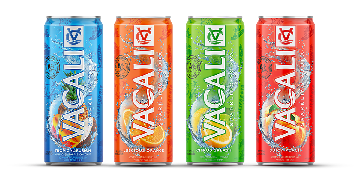
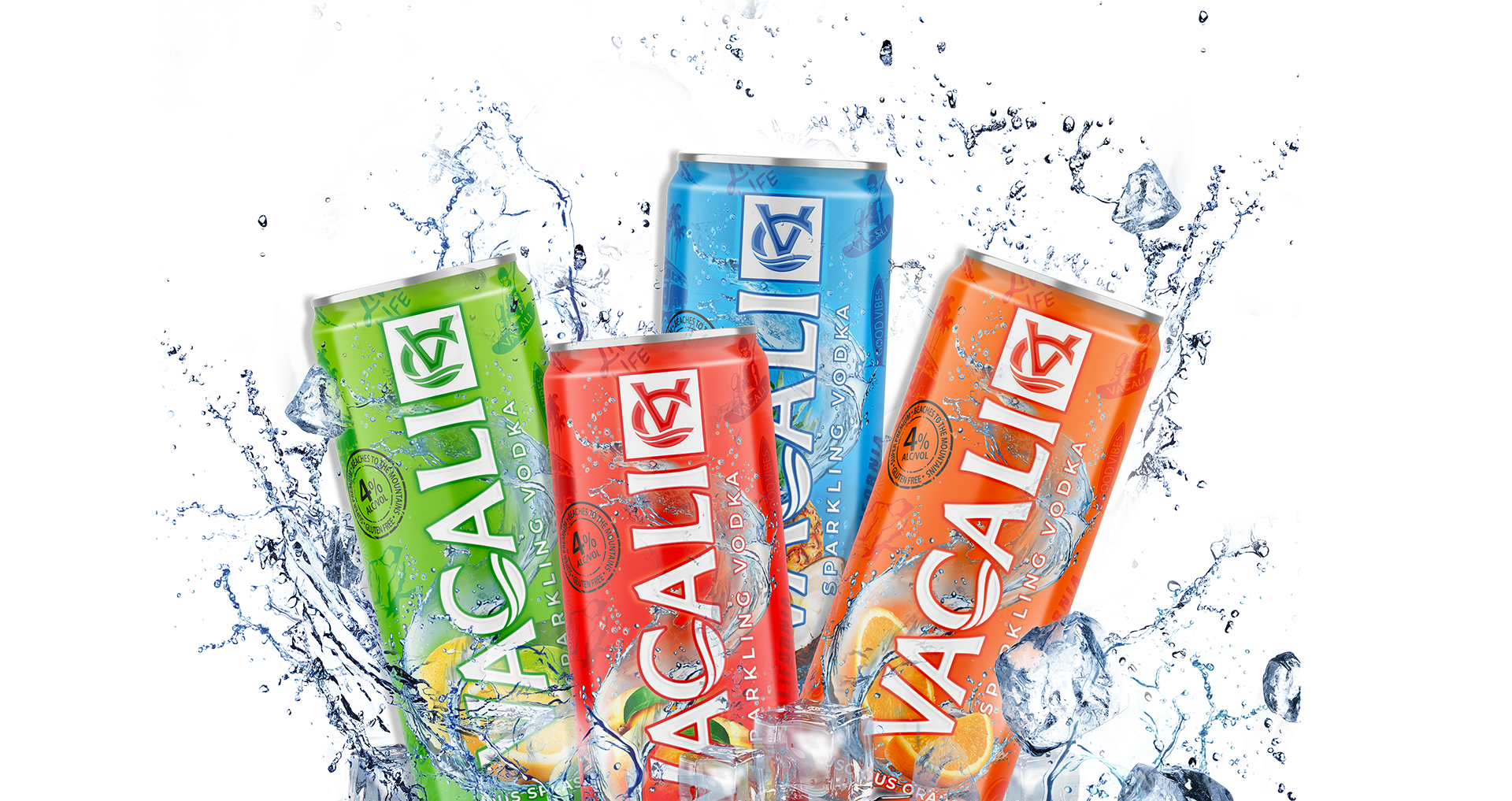
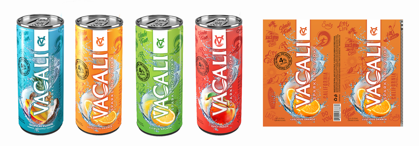
We engineered a comprehensive design system that standardized visual hierarchy across all product extensions while seamlessly accounting for complex production realities. Rather than treating each flavor as an isolated design, we built a modular framework that utilized strategic color zoning and curated imagery to drive flavor differentiation. This systemic approach built immediate flexibility into the brand's DNA, optimizing the pipeline for rapid future product and SKU expansions.
Operational Governance & Technical Quality Control
To safeguard design equity throughout the commercialization pipeline, I established a rigid technical framework for vendor execution. By defining precise production standards and mechanical guidelines, the creative division eliminated downstream manufacturing friction. This proactive governance included:
To safeguard design equity throughout the commercialization pipeline, I established a rigid technical framework for vendor execution. By defining precise production standards and mechanical guidelines, the creative division eliminated downstream manufacturing friction. This proactive governance included:
Color & Ink Optimization: Establishing strict CMYK and spot color configurations alongside precise white-ink opacity mapping to guarantee vibrant, uniform color payoff across varying substrate materials.
Dimensional Tolerance Management: Pre-engineering layouts to mathematically account for shrink-sleeve seam placement and material distortion across high-speed canning lines.
Supply Chain Cohesion: Packaging all brand assets into unified, turn-key production specifications. This standardized framework eliminated variations between separate print runs and regional manufacturing suppliers, ensuring a flawless, global market presentation.
Where it started...
Production & Technical Execution
Packaging was developed with full production specifications, including:
CMYK + spot color configuration
Raised and matte varnish applications
White ink layer for opacity control
Precise alignment for seam placement
This ensured consistency across print runs and suppliers.
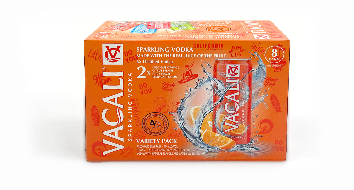
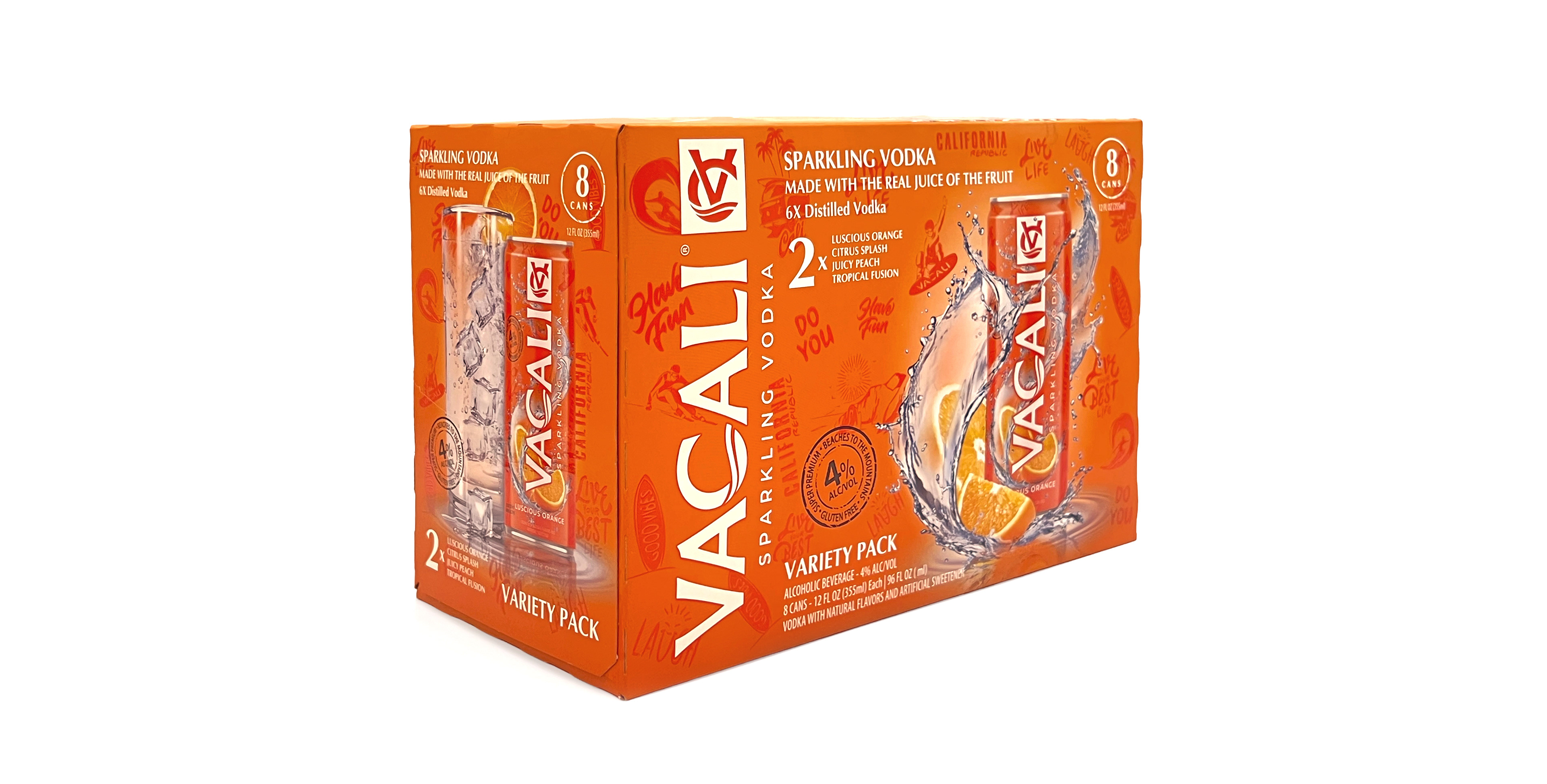
Multi-Pack System Design
The system extends into boxed packaging, maintaining brand integrity while adapting layout for scale and retail visibility.
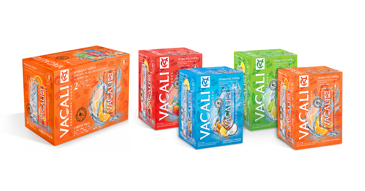
Retail & Shelf Presence
Packaging was designed to perform across retail environments, ensuring visibility from multiple angles and merchandising contexts.
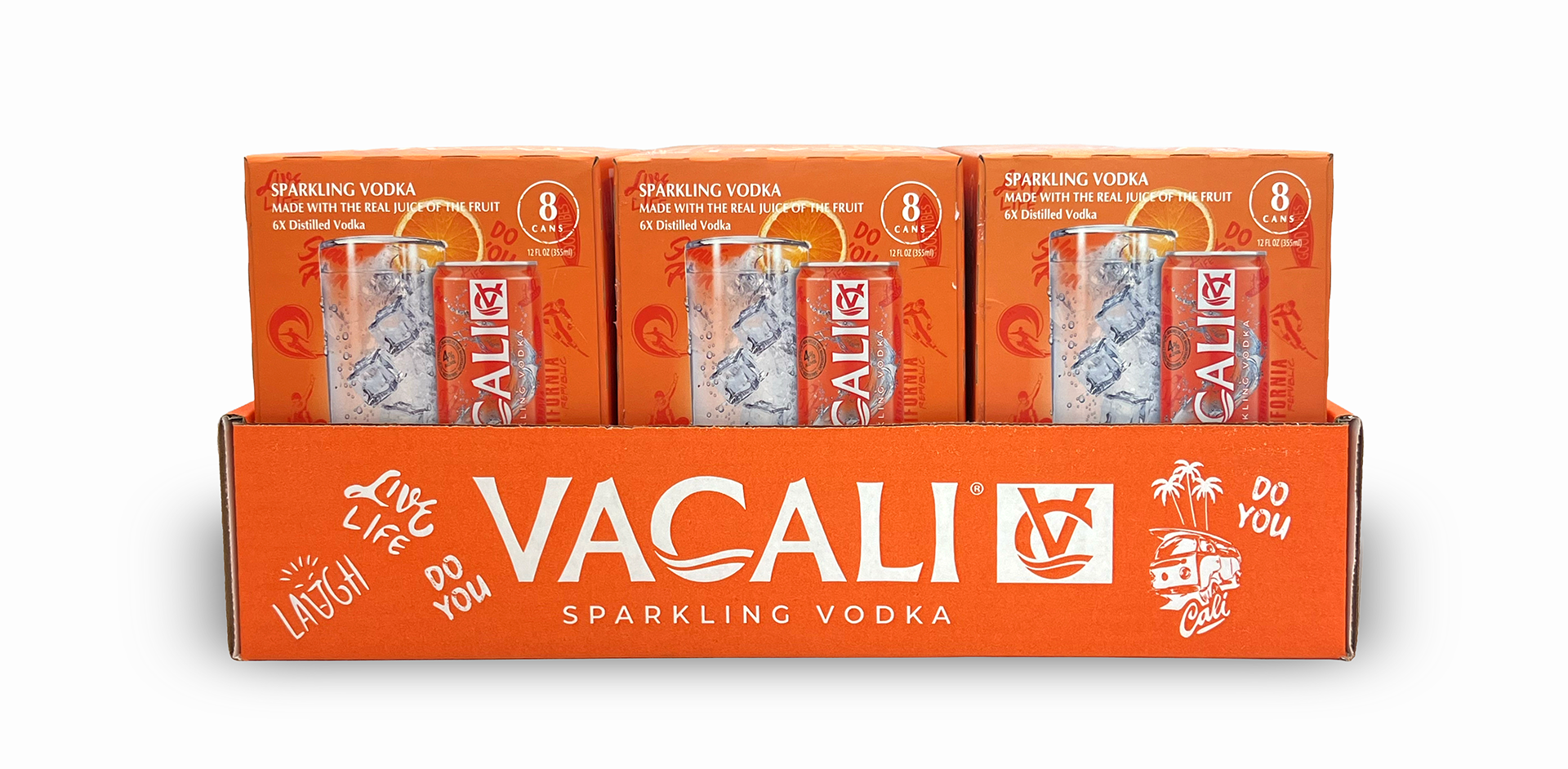
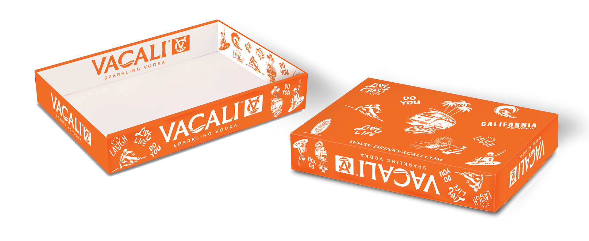
Secondary Packaging (Tray System)
Branded trays and display units extend the identity into in-store presentation and bulk product handling.
Final Merchandising System
The completed system delivers a cohesive brand presence across product, packaging, and retail display—designed for scalability and operational efficiency.