Concept
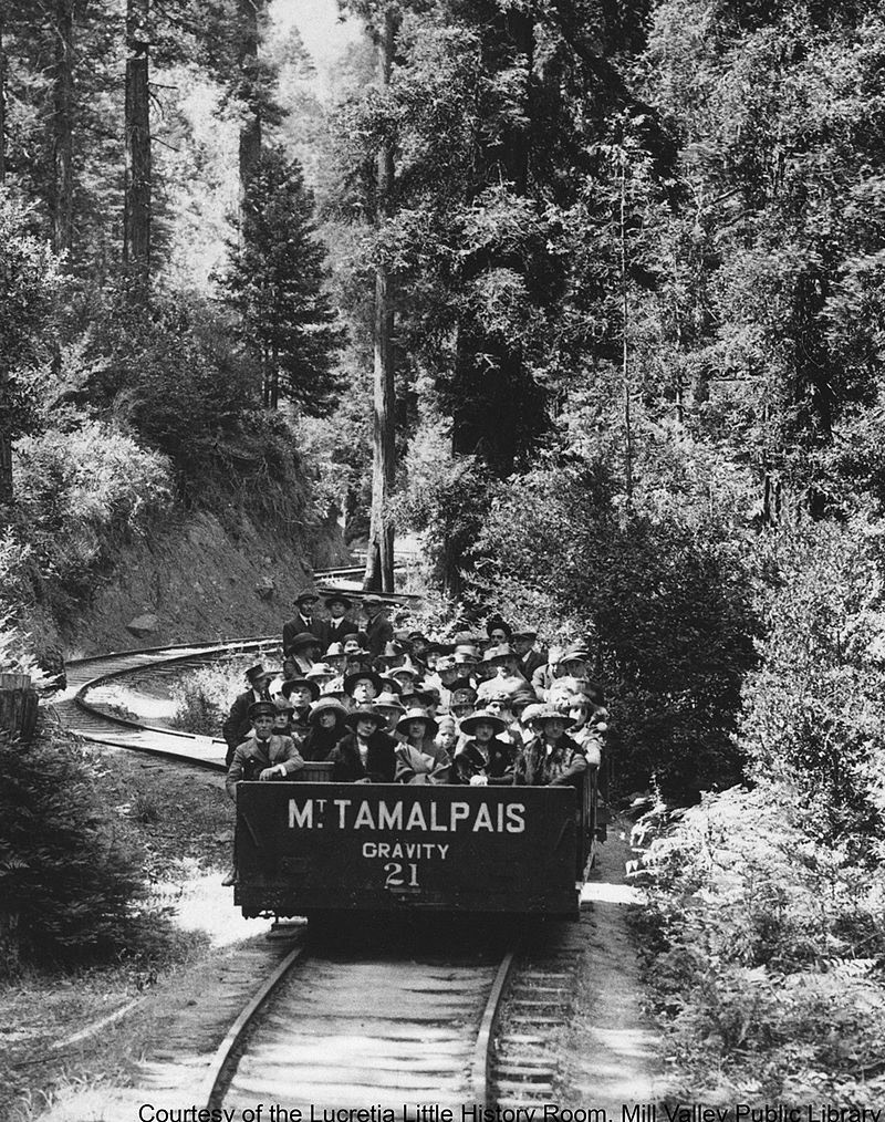
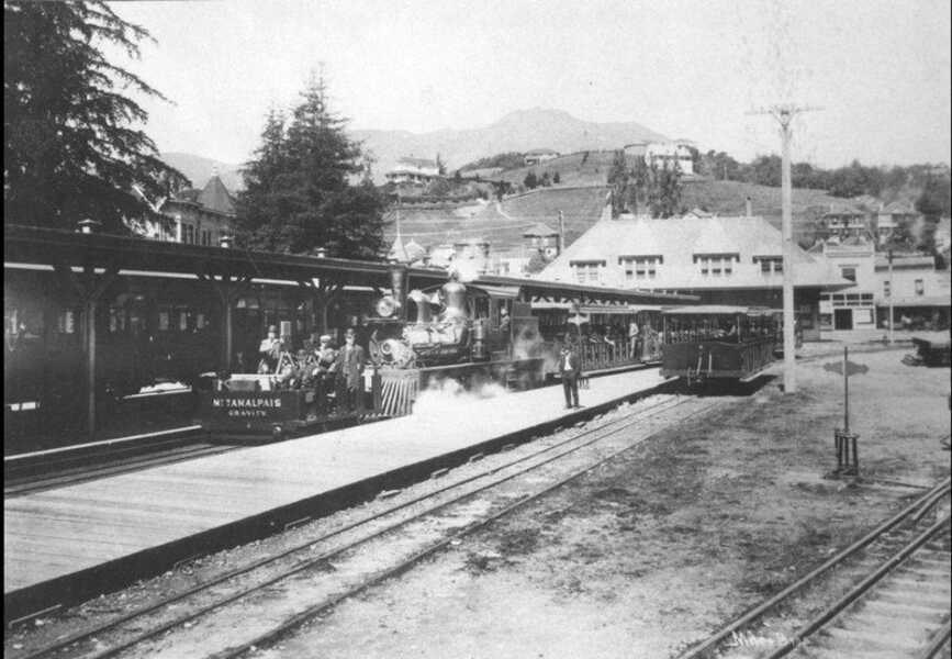
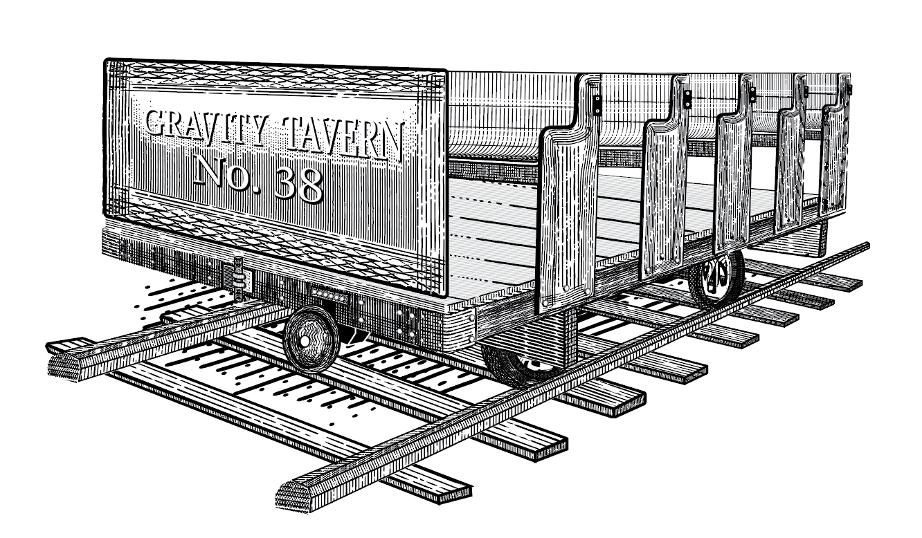
Gravity Tavern was inspired by the history of Mill Valley’s Gravity Train—a system once used to transport lumber down Mount Tamalpais. The concept centered on movement, elevation, and time, translating this historical narrative into a modern, elevated dining experience rooted in place and story.
System
A cohesive brand system was developed to reflect both the historical context and refined atmosphere of the space:
Typography: Classic, period-inspired serif paired with clean supporting type
Color Palette: Warm, grounded tones referencing wood, iron, and landscape
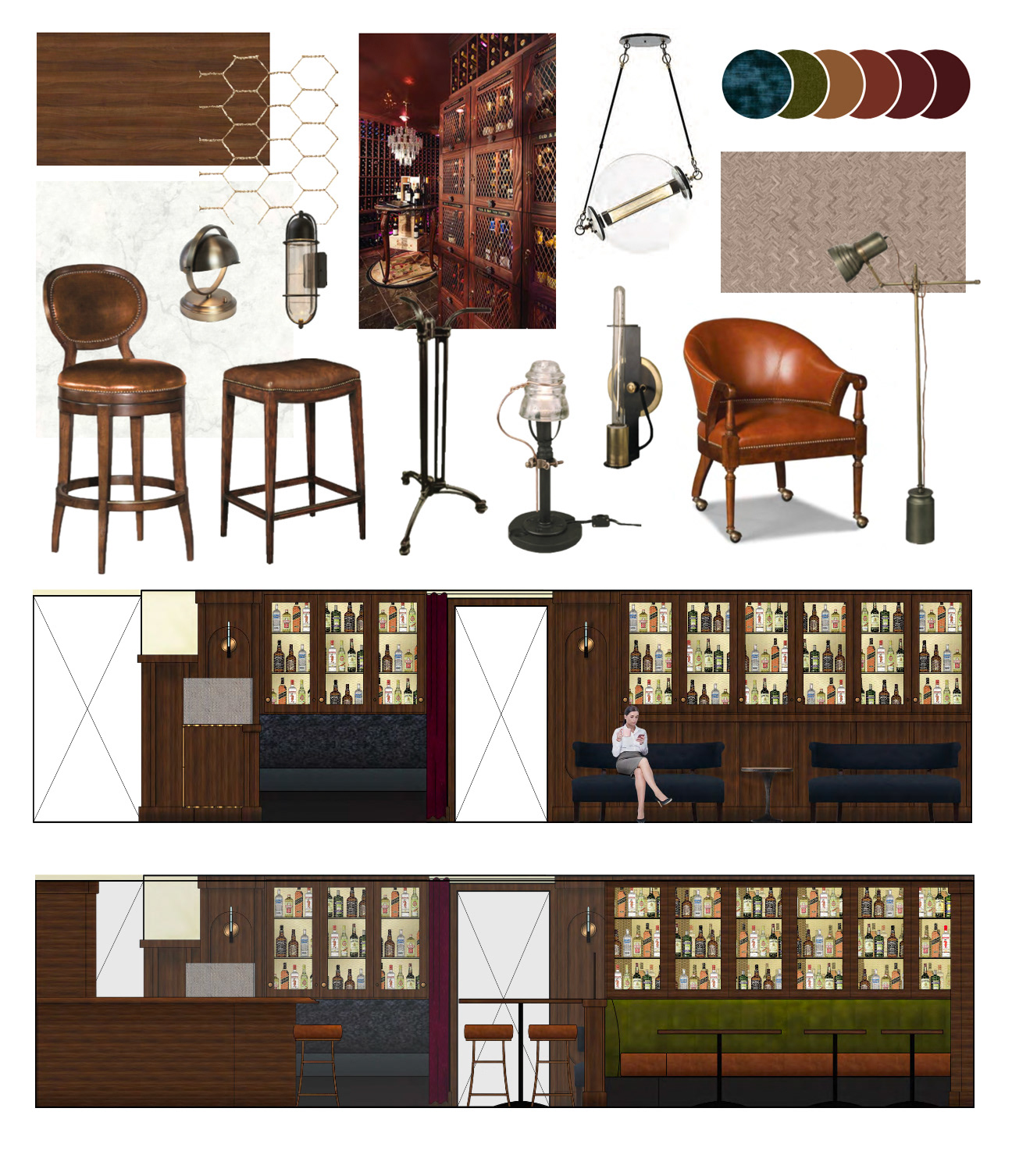
Material Language: Textures and finishes aligned with industrial heritage and elevated dining
Tone & Messaging: Balanced storytelling—historic reference with a modern, approachable voice
This system was designed to scale across all customer touchpoints while maintaining a consistent identity.
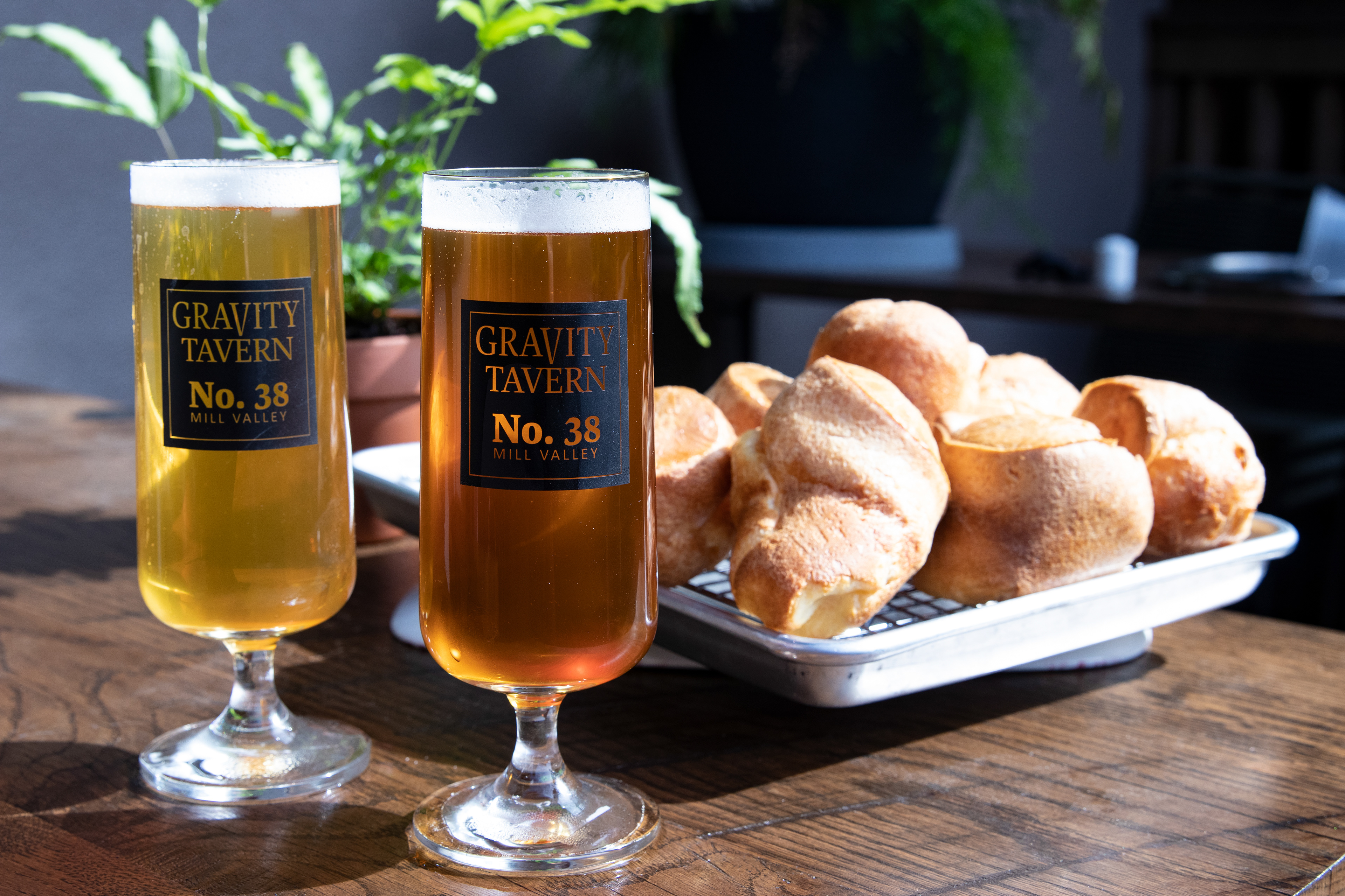
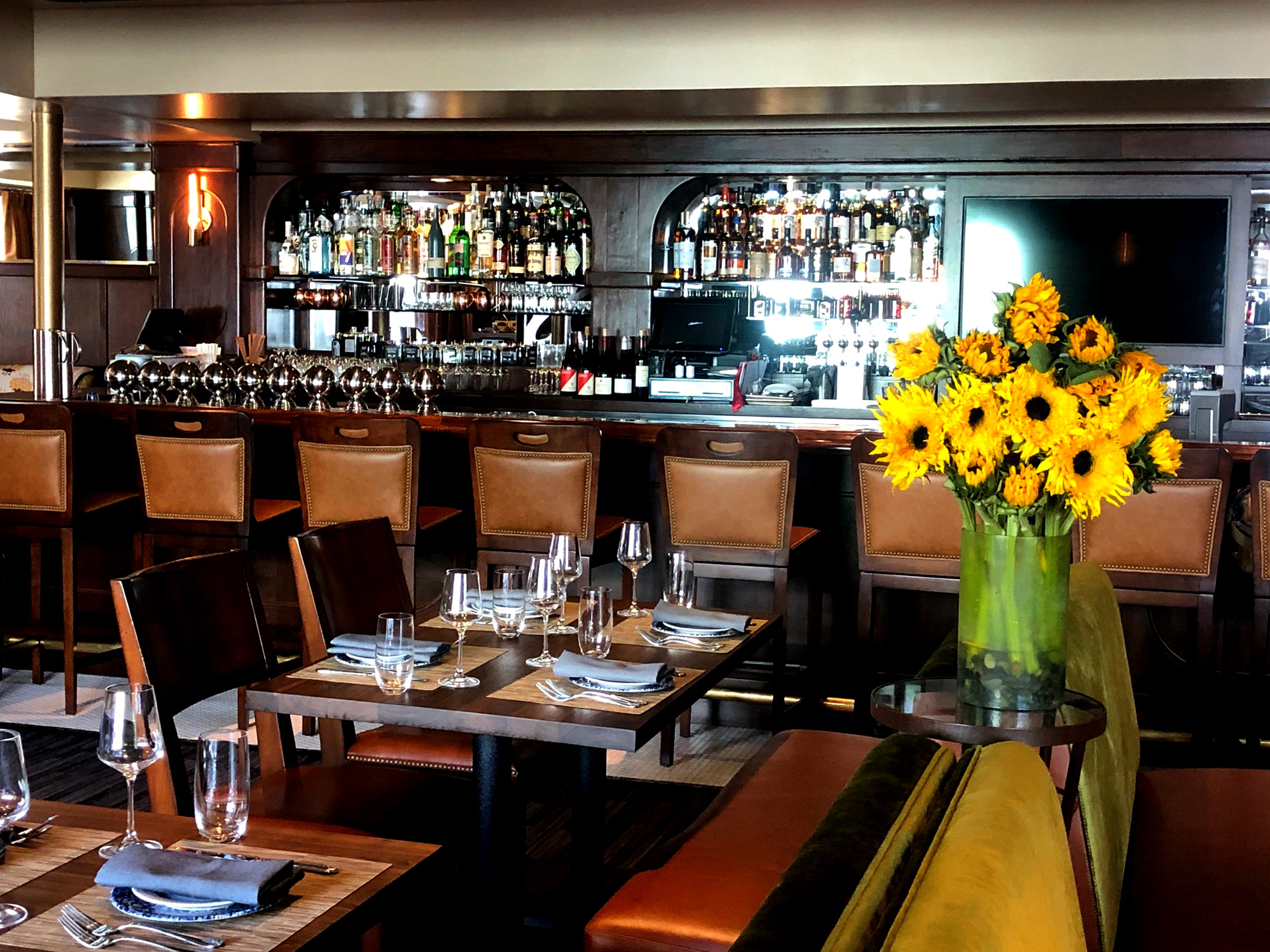
Execution
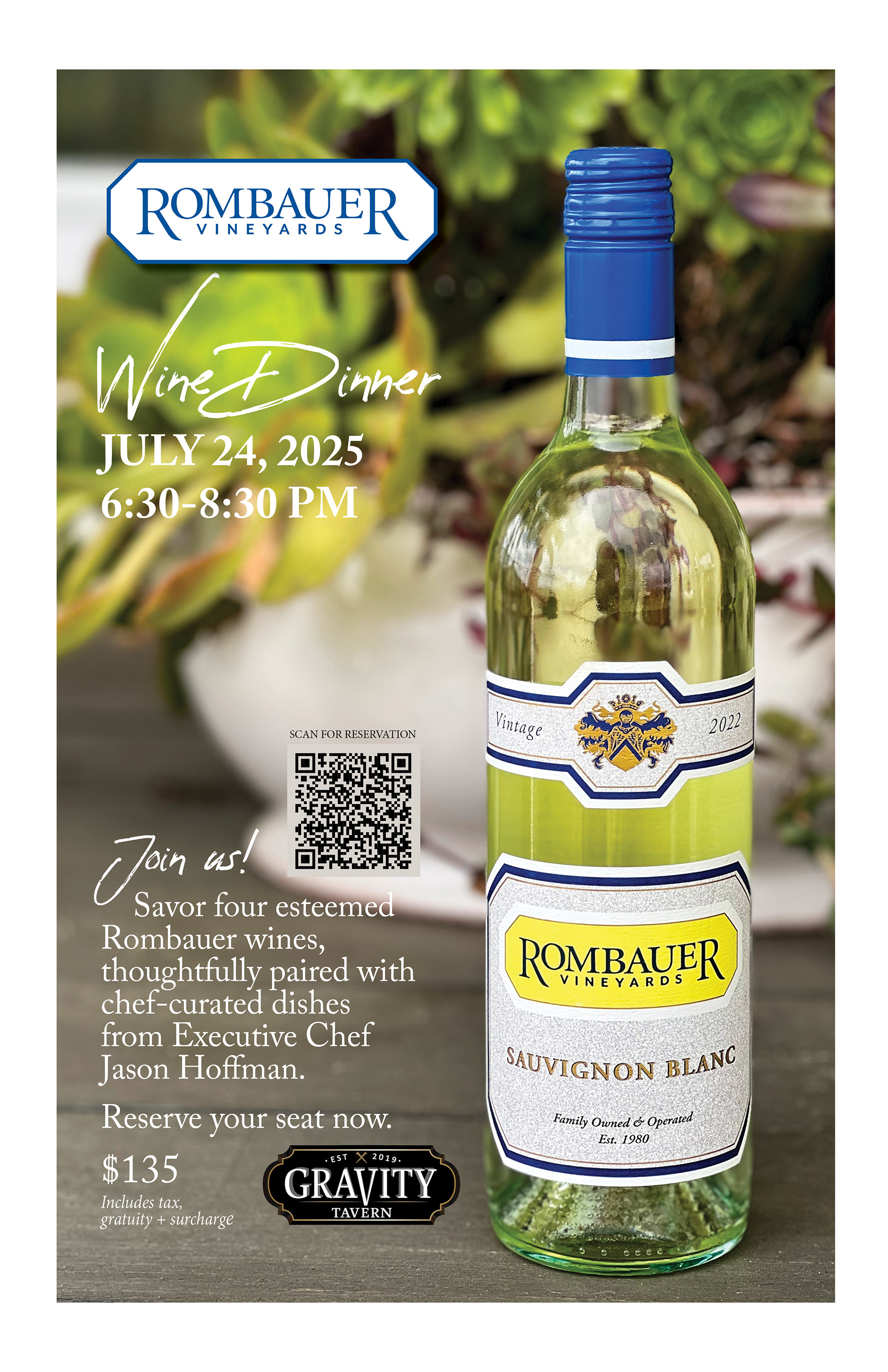
The brand was implemented across a full range of physical and digital applications:
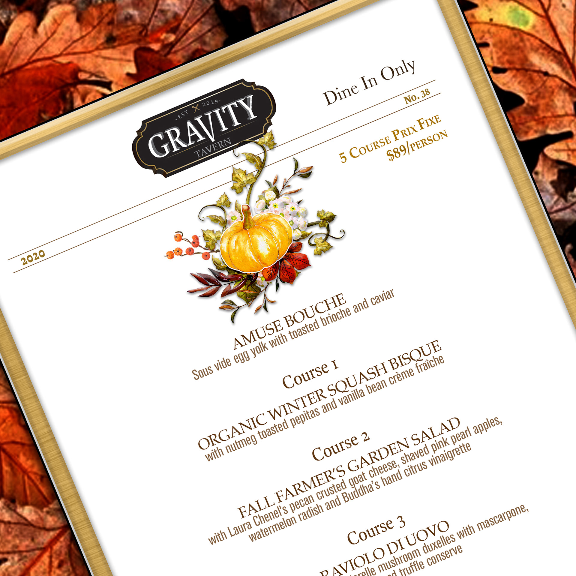
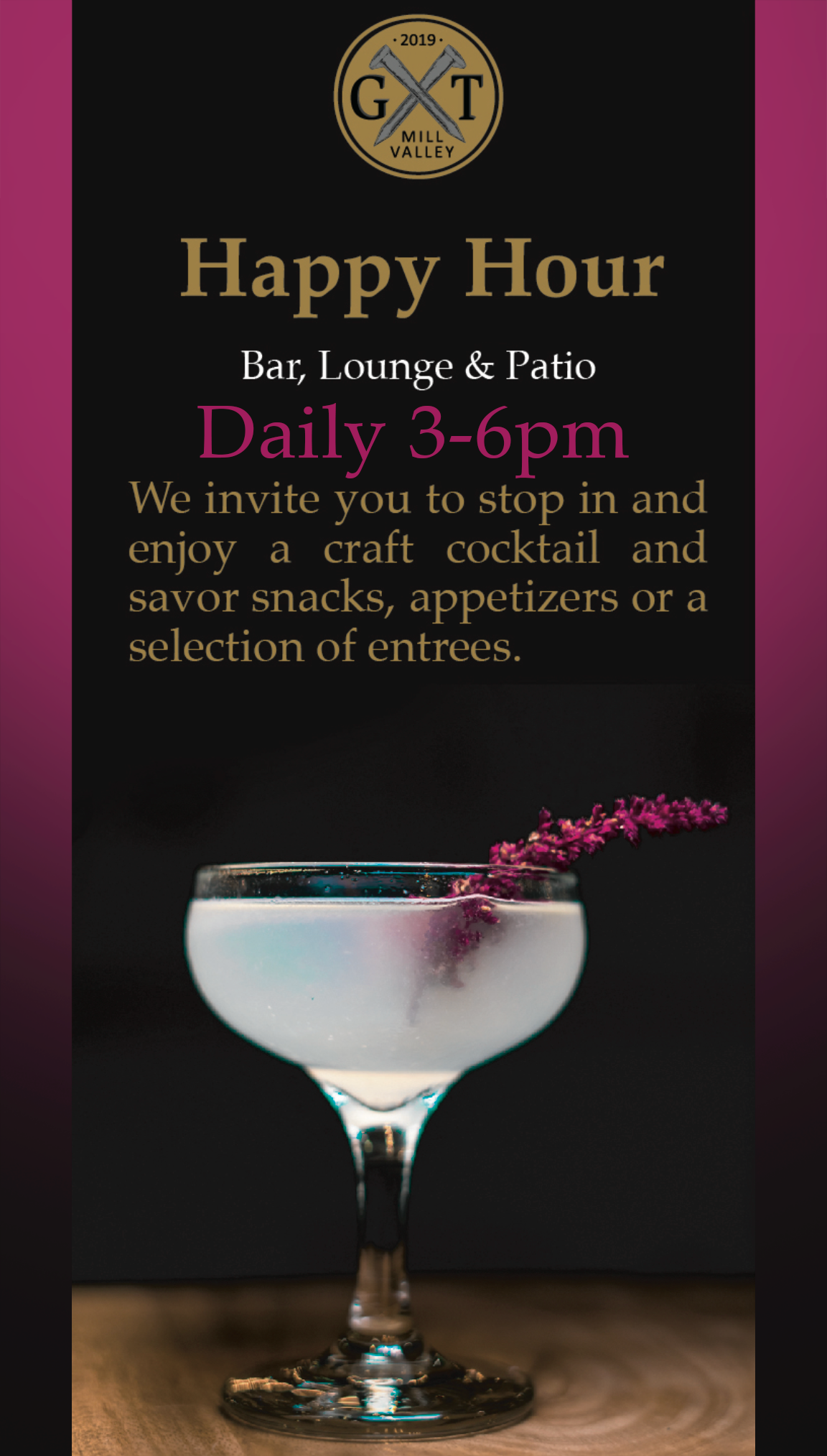
Multi-page editorial-style menus with structured hierarchy and narrative flow
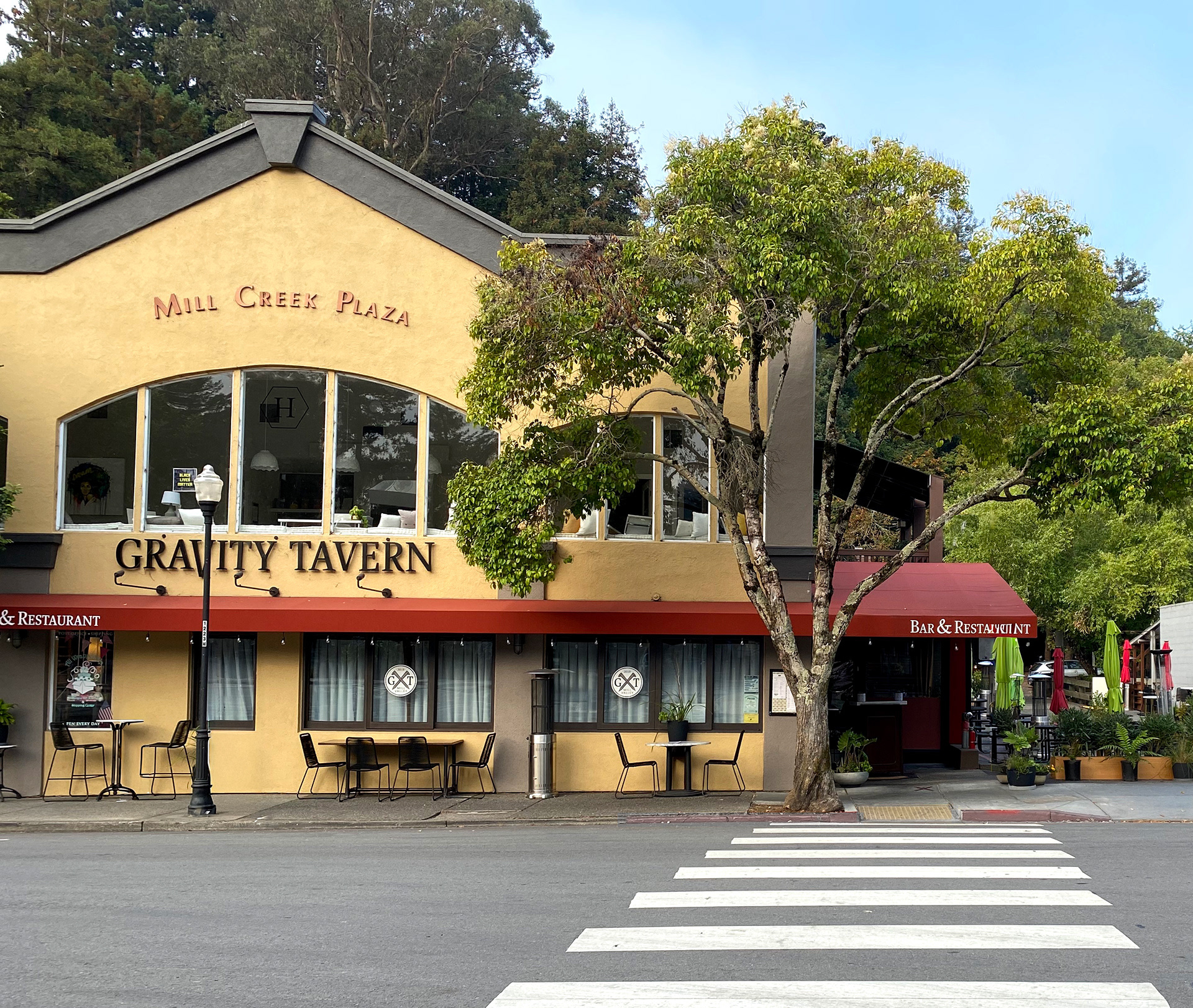
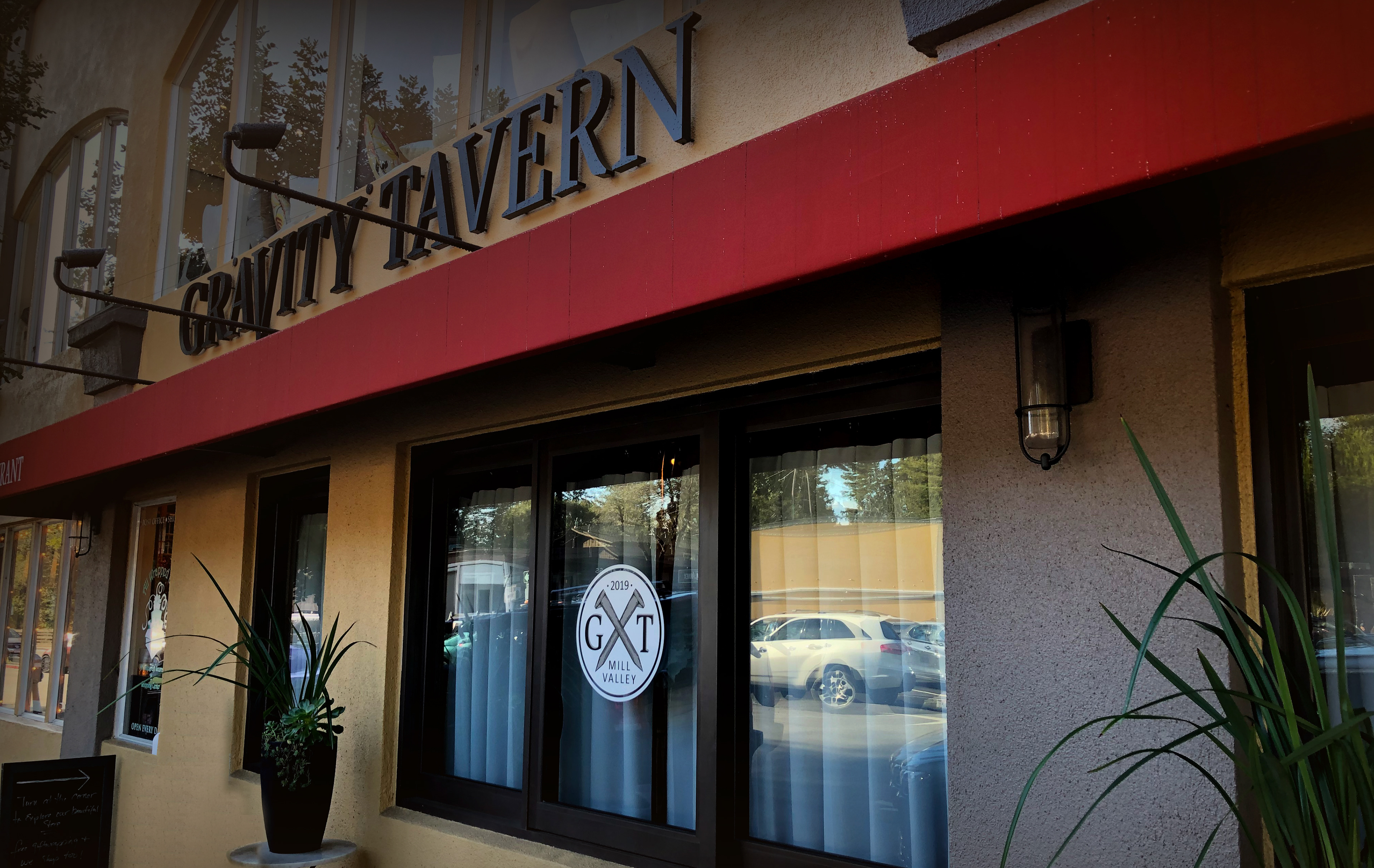
Environmental signage and in-space graphics reinforcing the concept
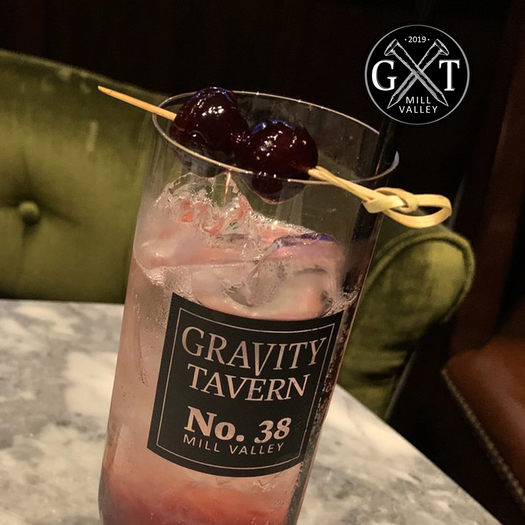
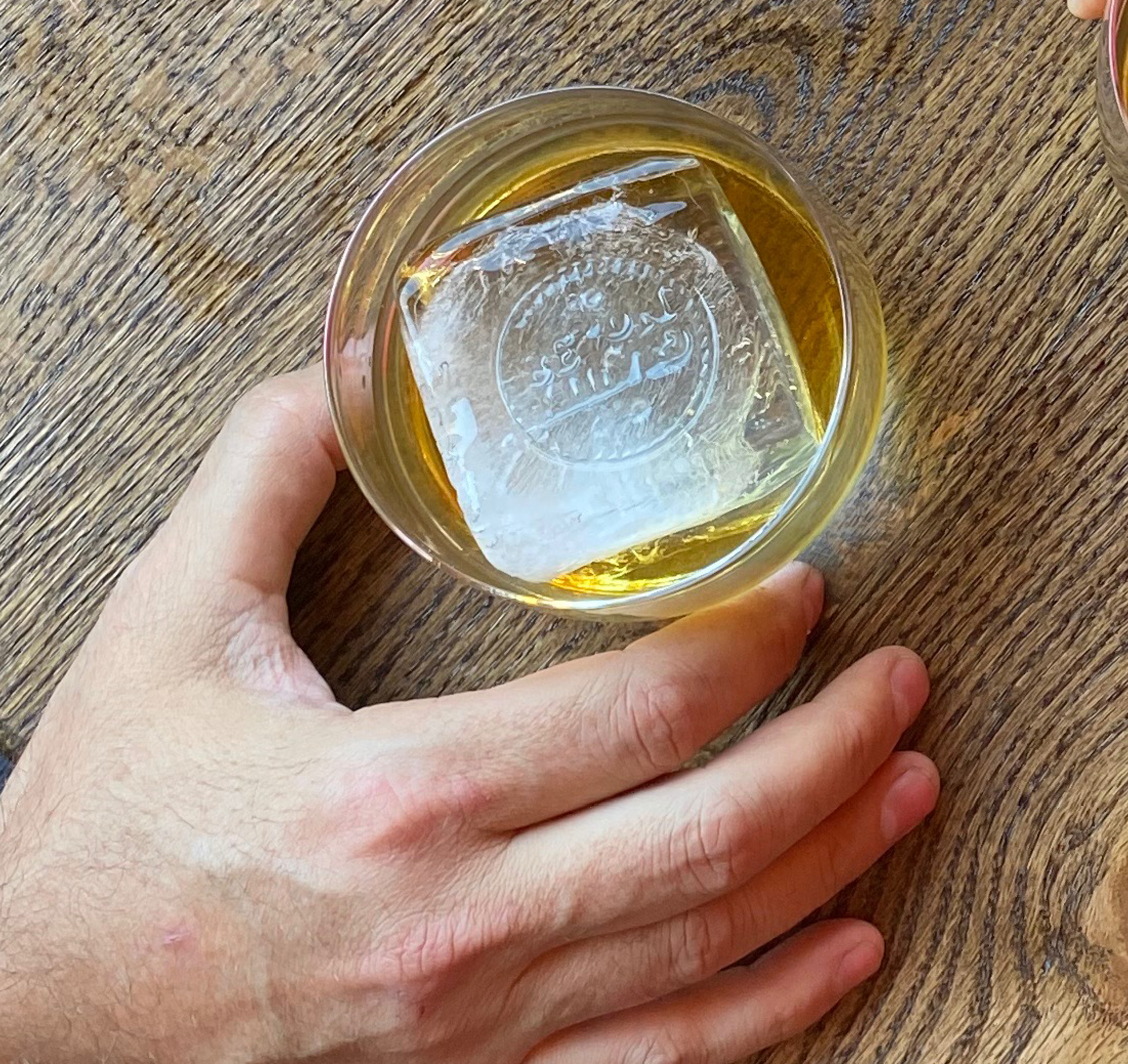
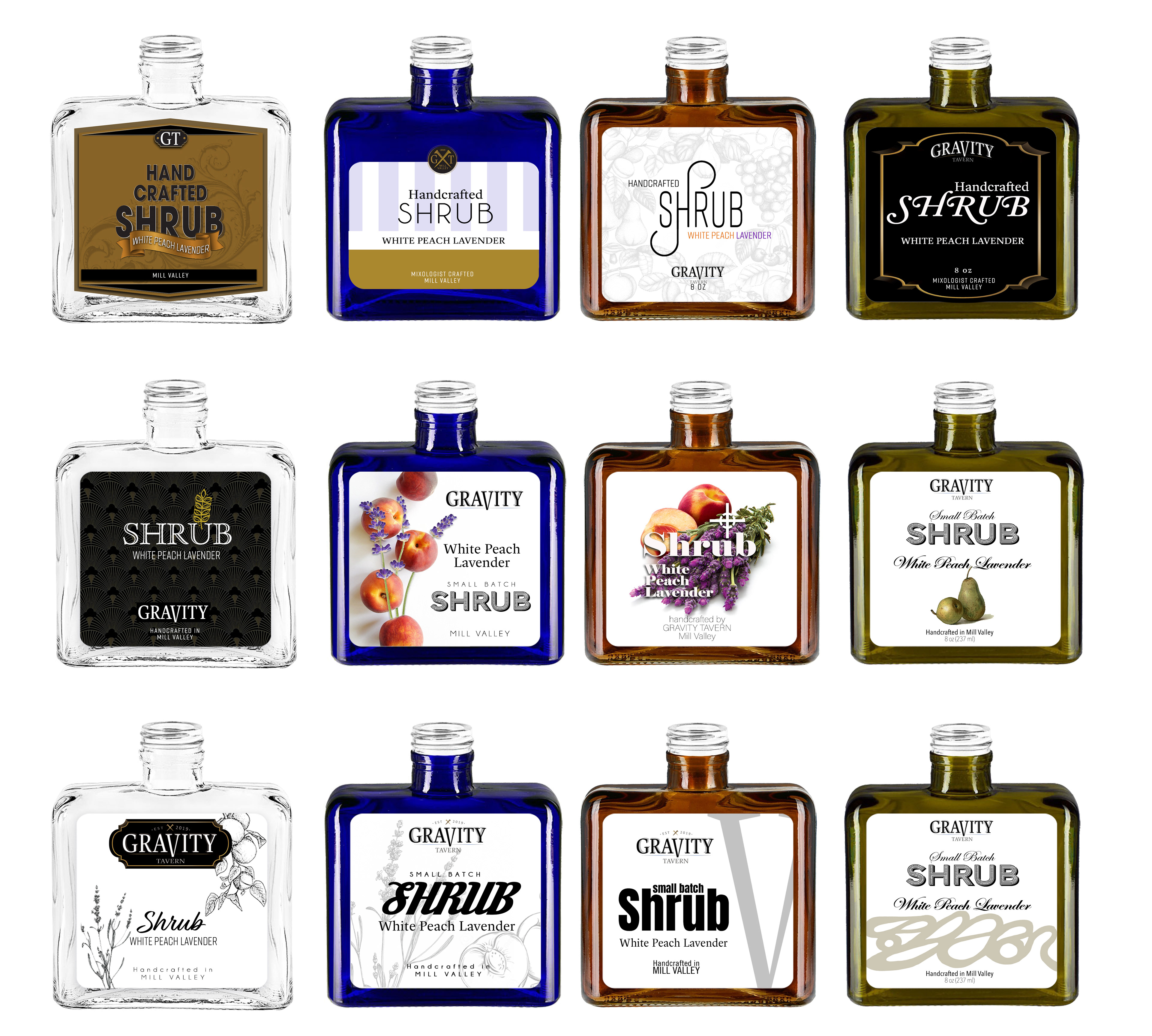
Custom glassware, plateware, and branded elements
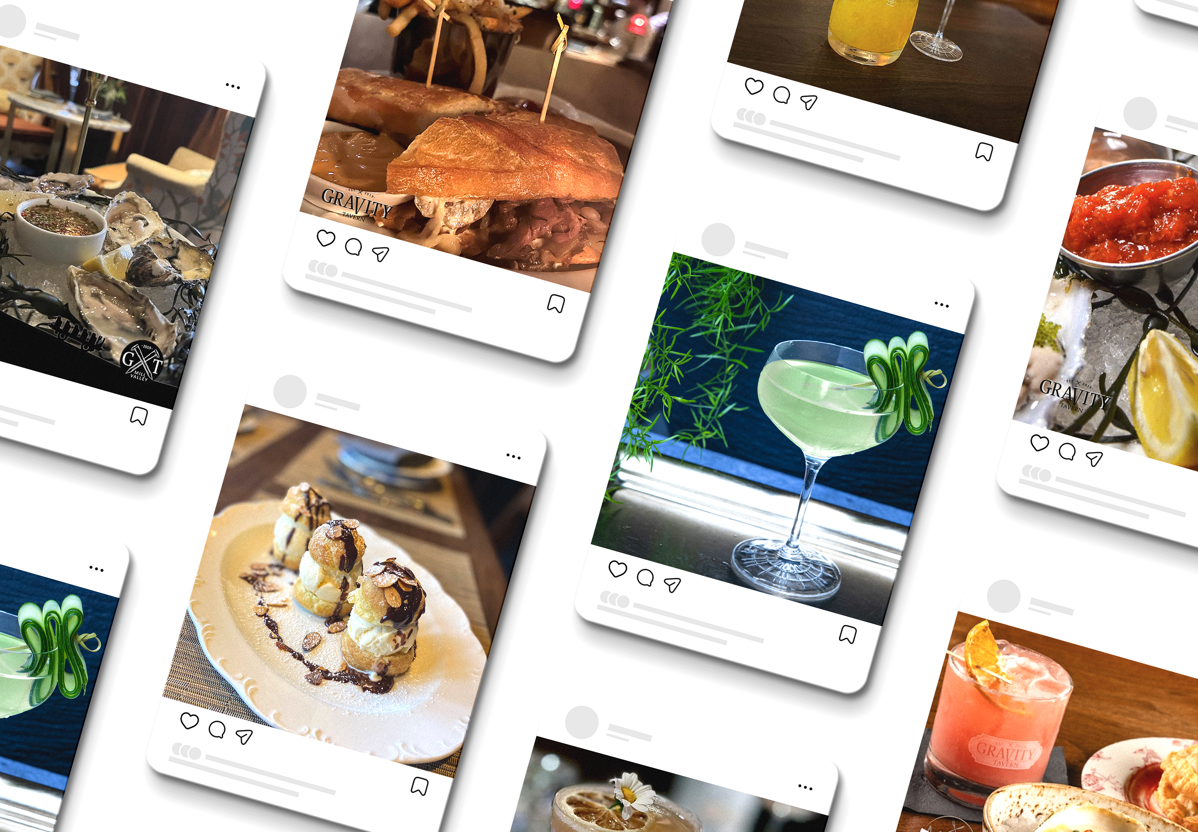
Social media and digital assets aligned with brand voice and visual system
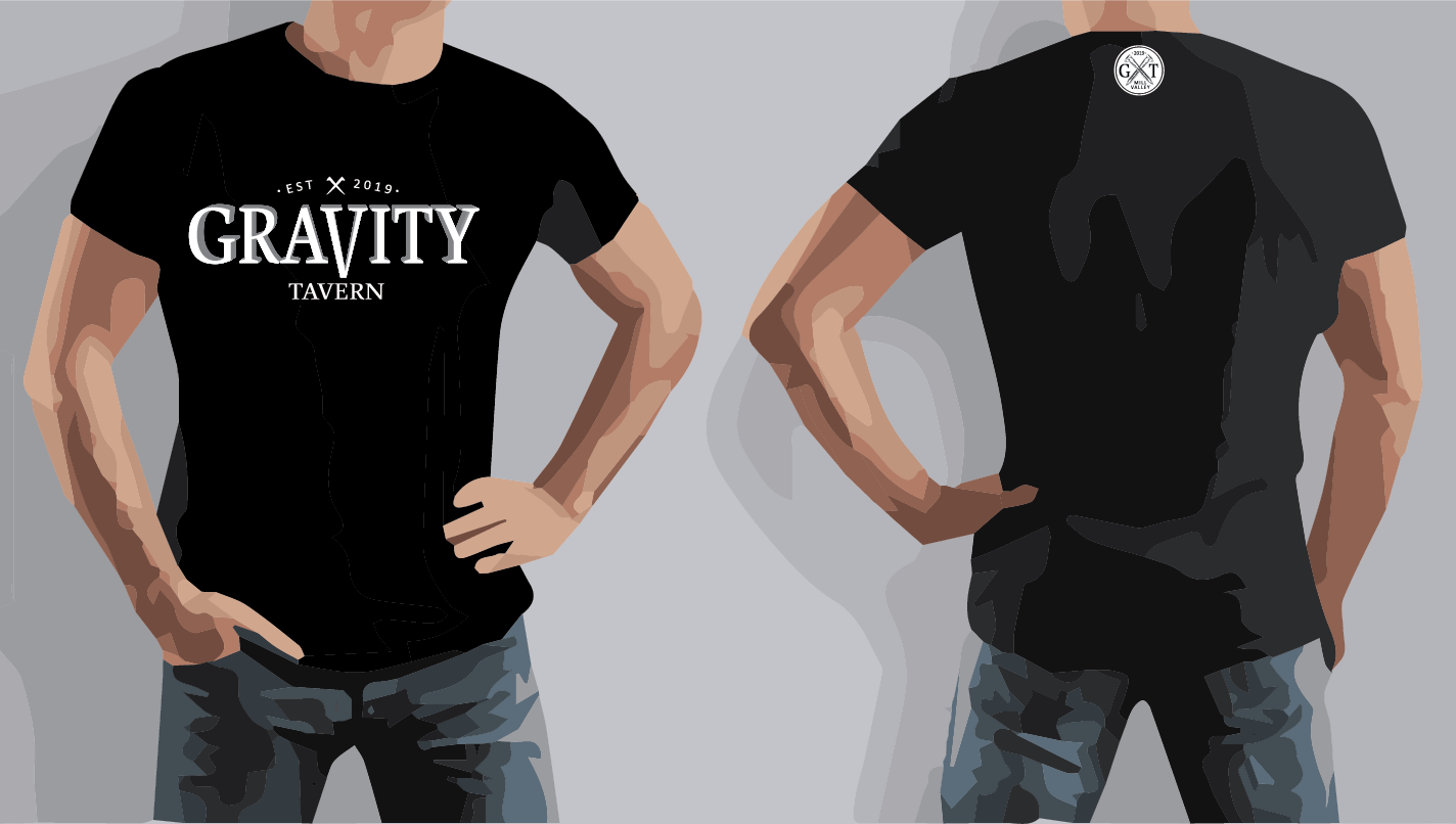
Business collateral including business cards, printed materials, and promotional assets
All elements were designed to work together as a unified experience rather than isolated pieces.
Outcome
Gravity Tavern launched with a distinct and memorable identity, creating a cohesive guest experience that connected history, design, and atmosphere. The project established a scalable brand system that supported both day-to-day operations and ongoing marketing, contributing to strong positioning within a competitive hospitality market.
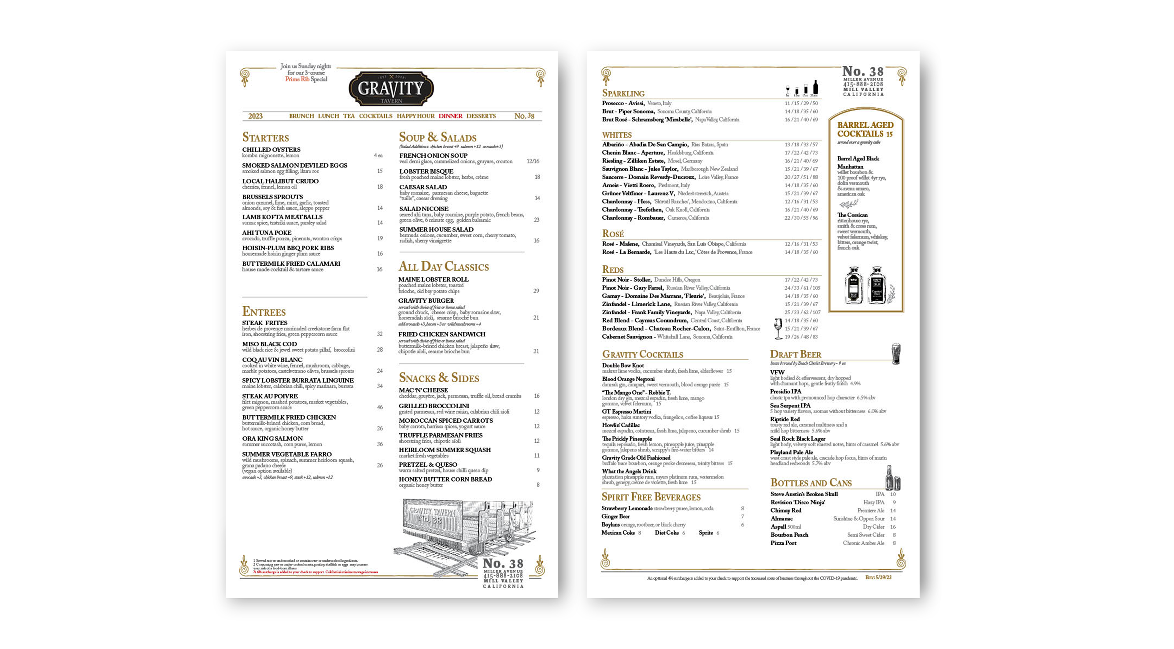
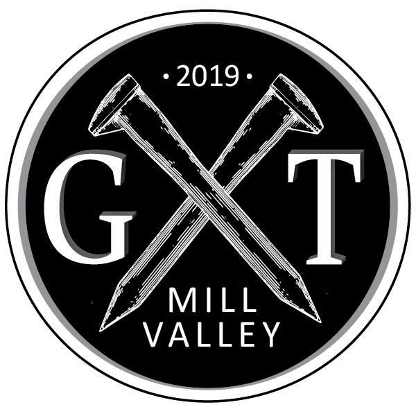
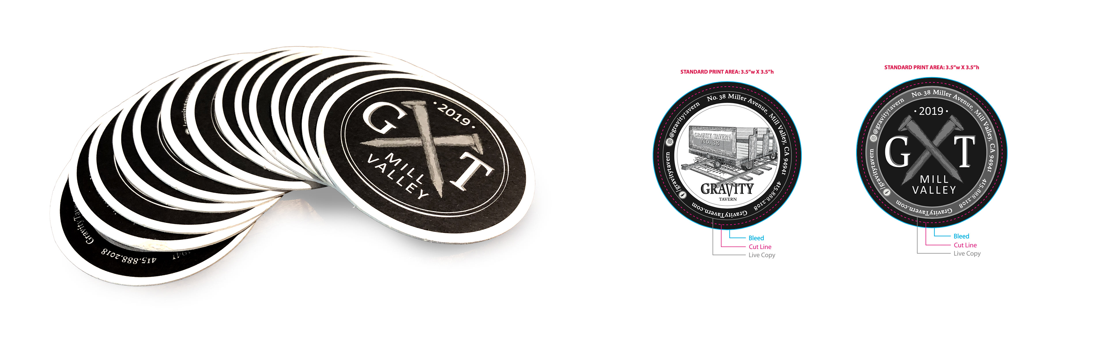
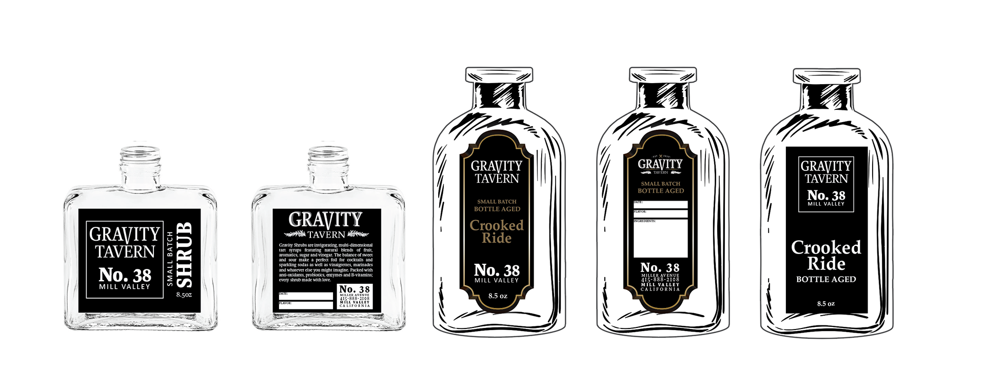
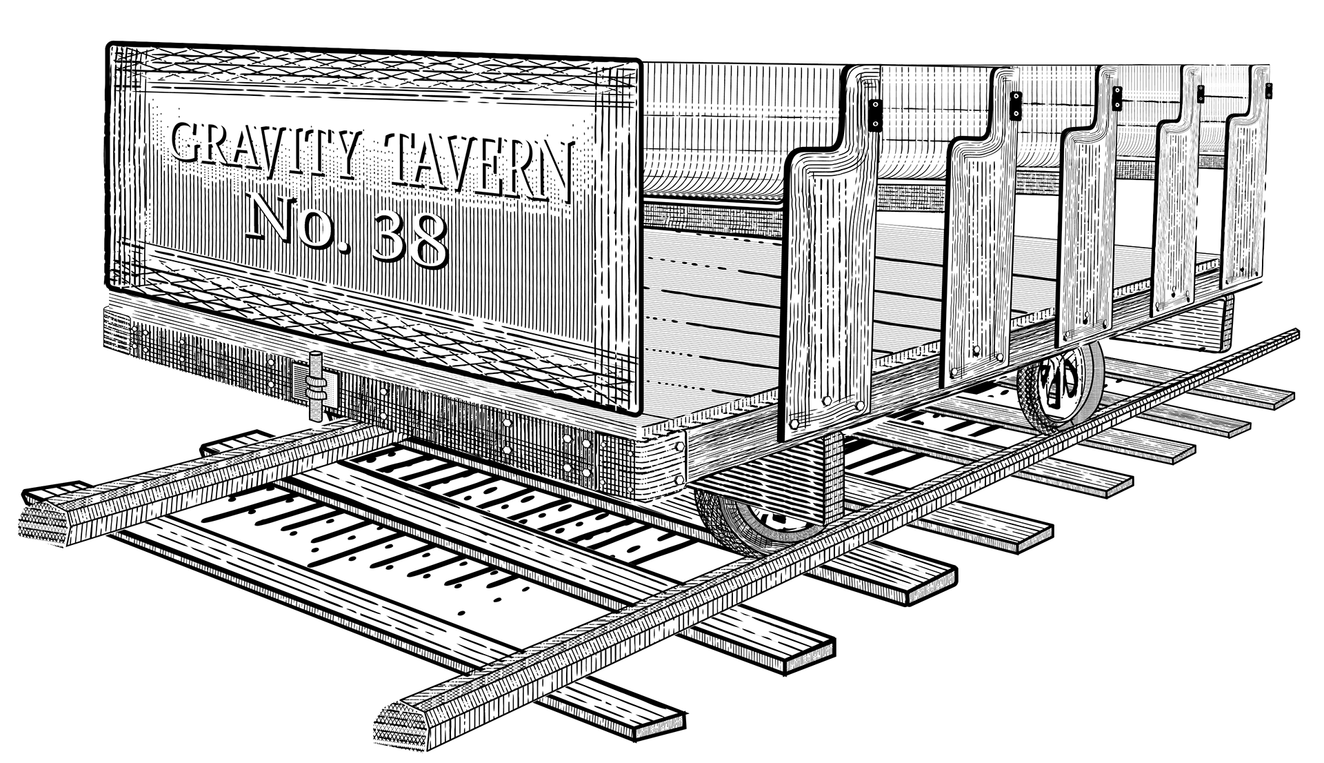
Concepts (below) and Final Designs. (Above)
Housemade shrubs- just like back in the day.

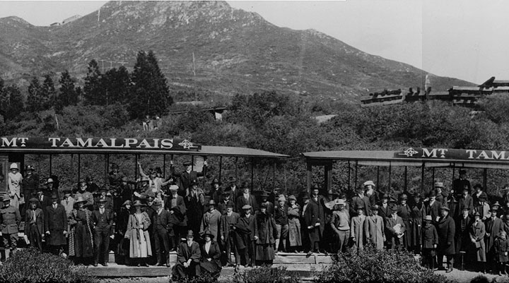
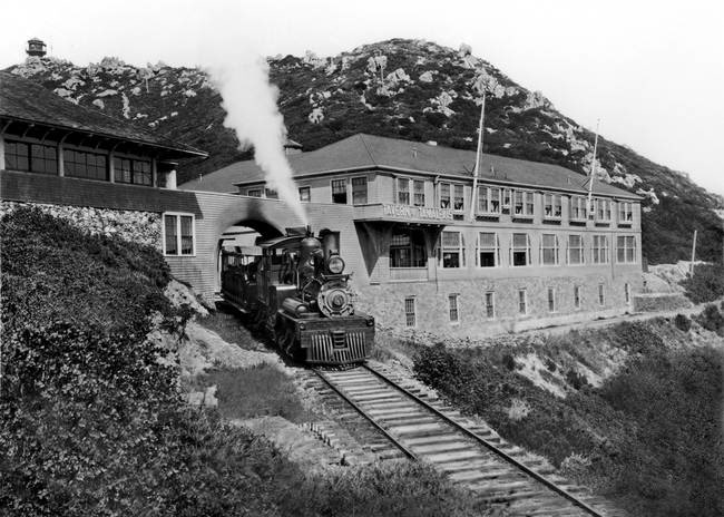
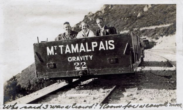
How it all began.
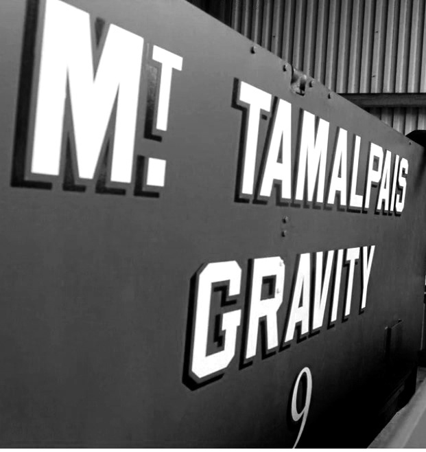
Rich in history.