
Led the development of a character-driven snack brand from concept through retail launch, including packaging, brand identity, and scalable system design. The product achieved placement in Walmart, requiring a shift from expressive storytelling to high-impact shelf clarity while maintaining brand personality.
Overview
Comedy Corn is a veteran-owned snack brand built around a simple idea: joy.
The goal was to create a product that feels lighthearted, approachable, and memorable—while still performing in a competitive retail environment. From initial concept through retail placement and redesign, the brand was developed to balance personality with clarity, and storytelling with shelf impact.

Brand Foundation
The brand was built from the ground up, including:
Logo design
Color system
Typography selection
Character development
At the center of the brand is Poppy, a signature character designed to embody humor, warmth, and approachability. Poppy serves as both a visual anchor and a storytelling device across packaging and brand extensions.
The tone was intentionally set to feel:
Lighthearted
Uplifting
Accessible
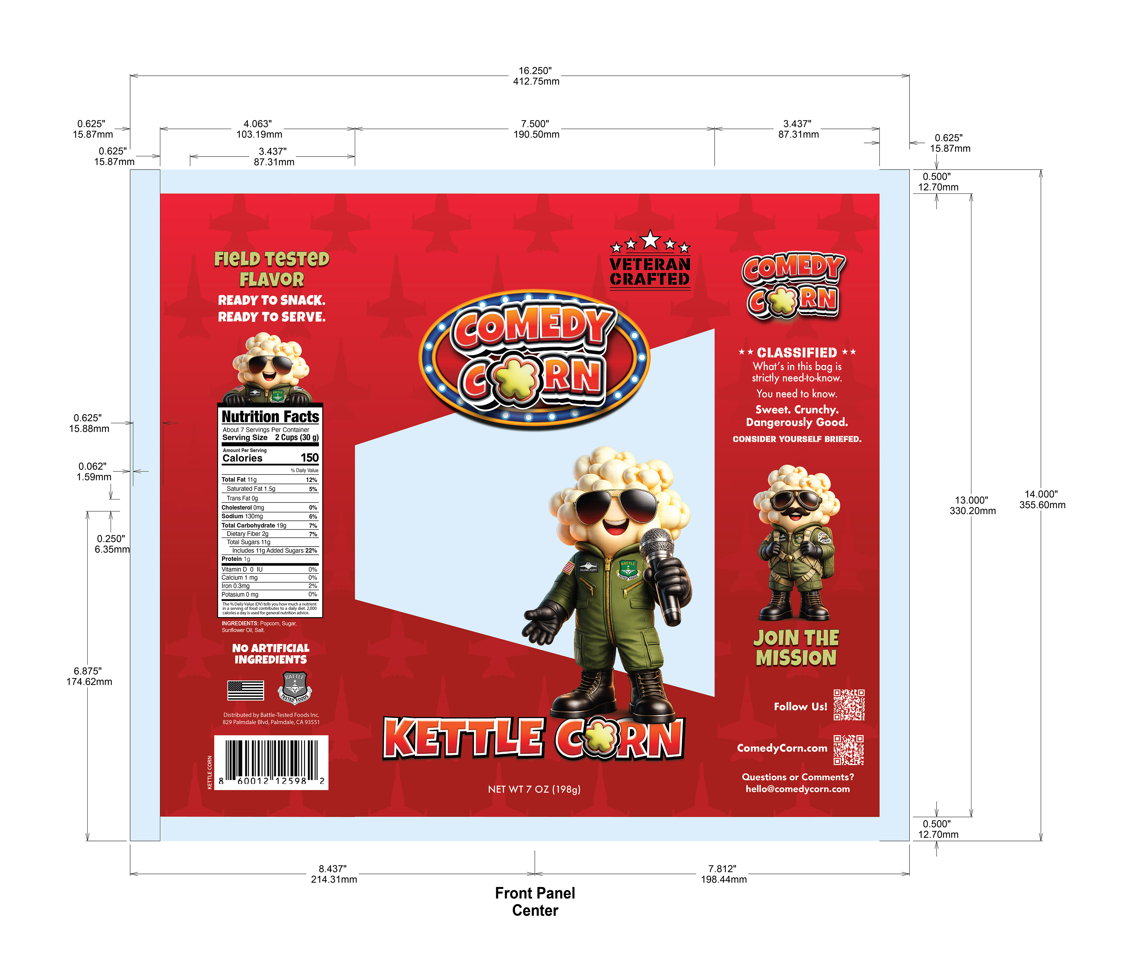
Production & Structure
The packaging system was designed with production in mind, including:
Layout adjustments for larger format bags
Structured panel hierarchy for front and back communication
Integration of regulatory and nutritional requirements without disrupting design
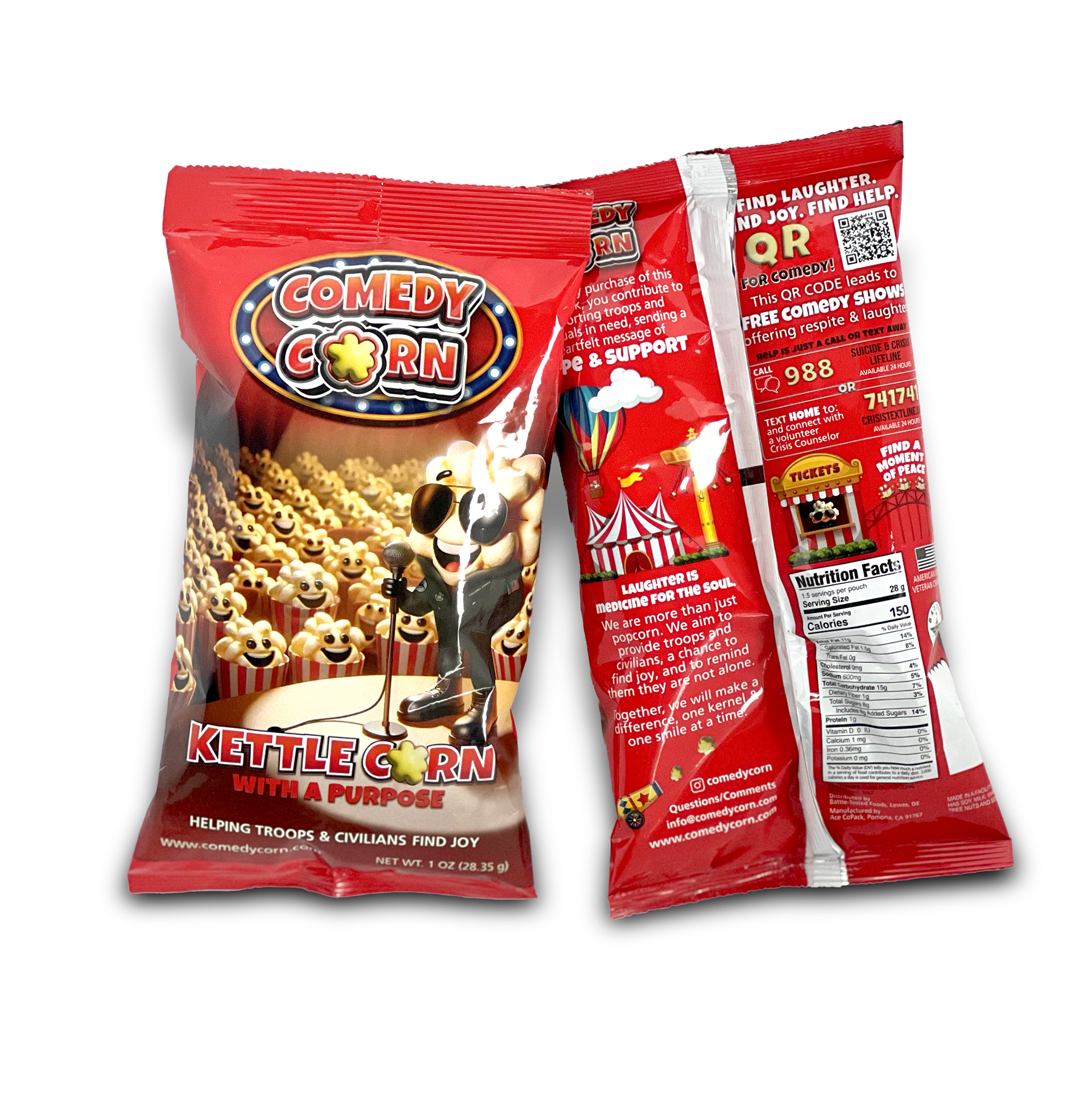
Initial Packaging (Retail Entry-below)
(first image set — Walmart packaging)
The original packaging established the brand visually and successfully brought the product to retail, including placement in Walmart.
The design emphasized:
Narrative storytelling through multiple illustrated elements
A lively, entertainment-driven environment (circus, performance, audience)
Character-driven engagement
Custom elements included:
AI-generated laughing popcorn crowd visuals
Modified stock imagery for environmental storytelling
A performance-stage concept centered around Poppy
This version successfully introduced the brand and validated its market appeal.
The Challenge
As the product scaled, the packaging required refinement.
Key challenges included:
Reducing visual complexity for stronger shelf readability
Adapting the design to a larger 7 oz format (from 1 oz)
Improving hierarchy and clarity of messaging
Maintaining brand personality while simplifying execution
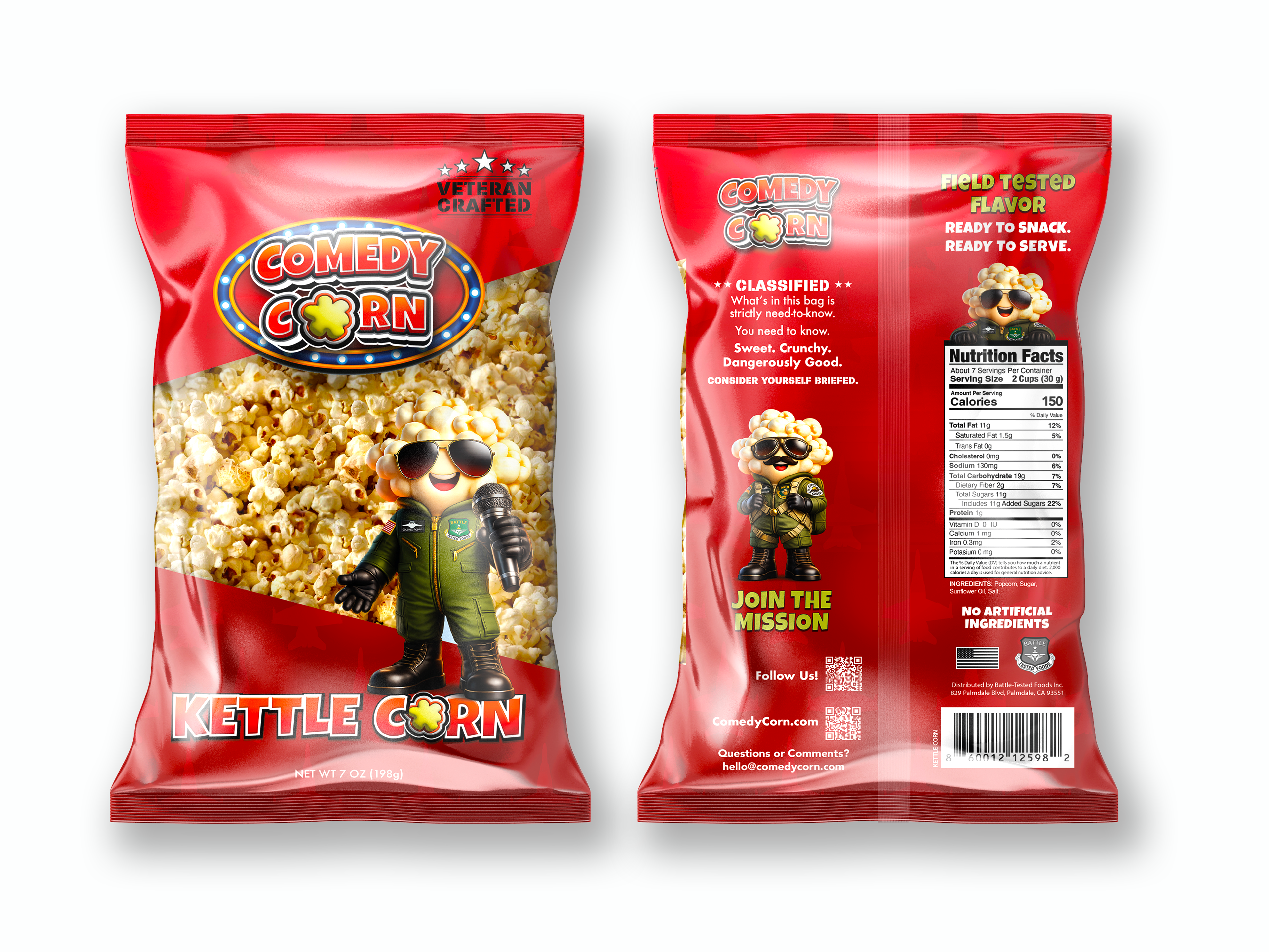
Design Evolution
The updated packaging shifts from storytelling-heavy to focused brand clarity.
Key changes: (above)
Simplified front panel
Poppy becomes the sole focal point
Removal of secondary characters and environmental clutter
Improved hierarchy
Clearer product naming and readability
Streamlined messaging for faster consumer recognition
Refined brand system
Updated and upscaled Kettle Corn logo
Consistent use of typography and spacing
Pattern integration
Introduction of a custom jet repeat inspired by Poppy’s jumpsuit
Adds texture without overwhelming the design
Information editing
Removal of excess copy
Retention of essential, high-impact messaging only
Past vs. Present
Poppy
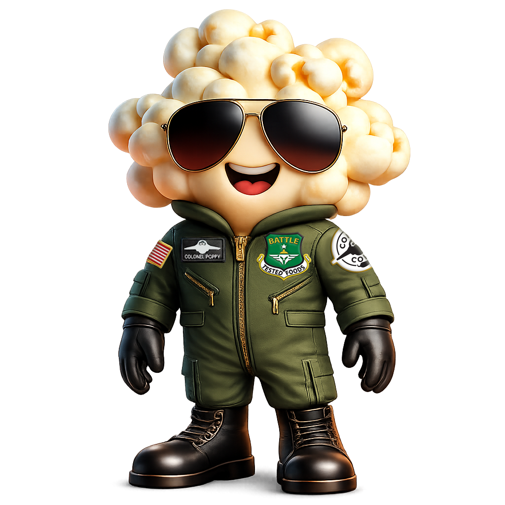

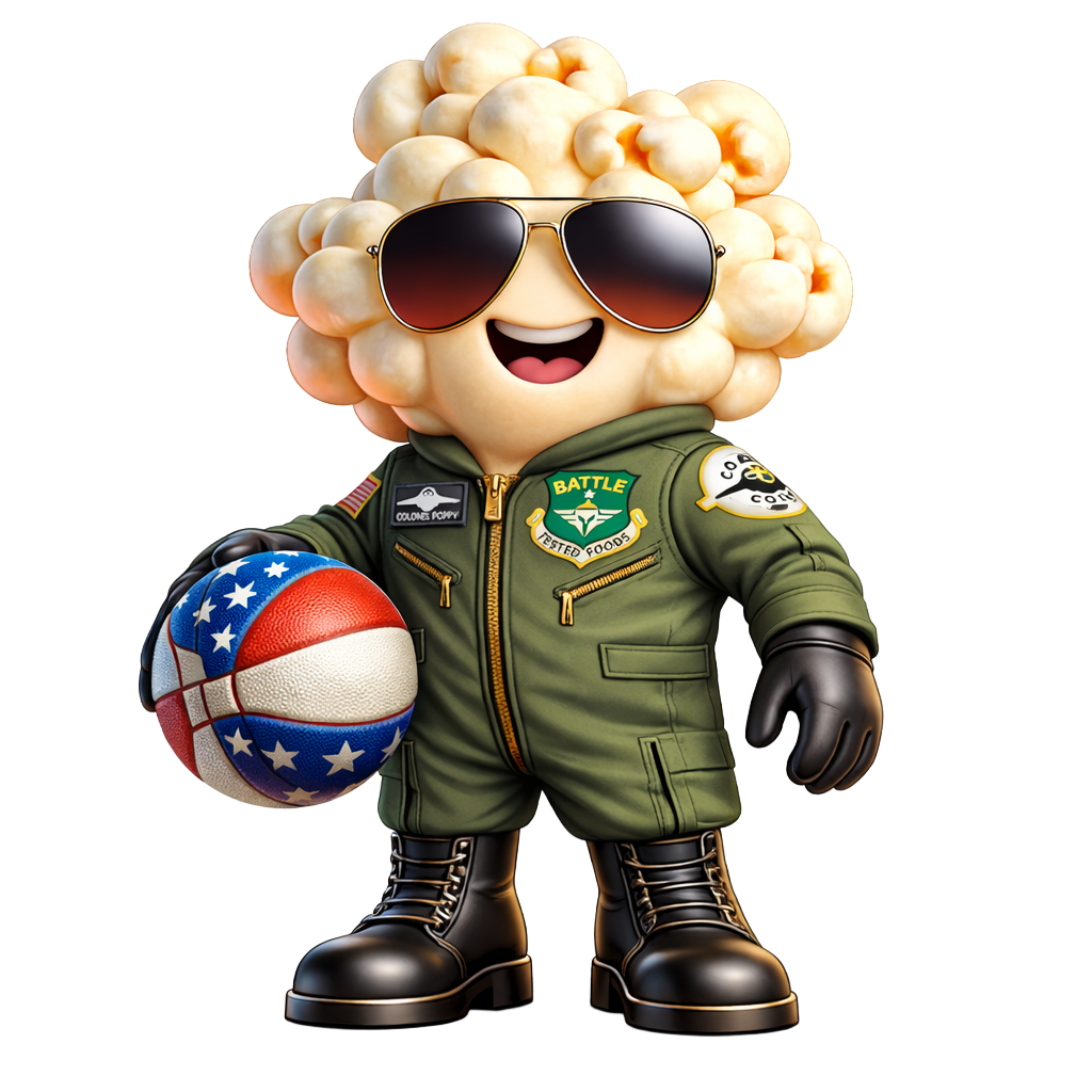
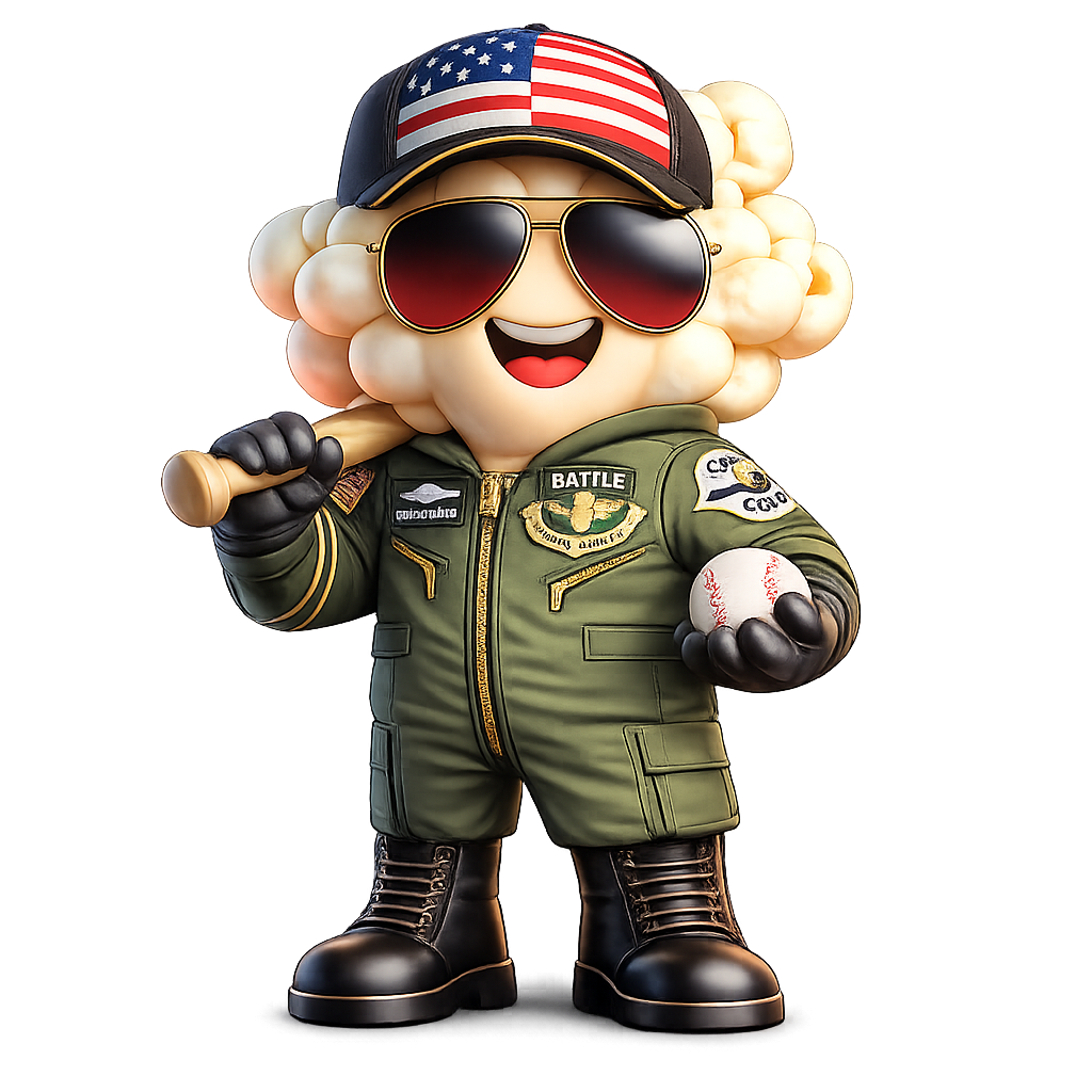
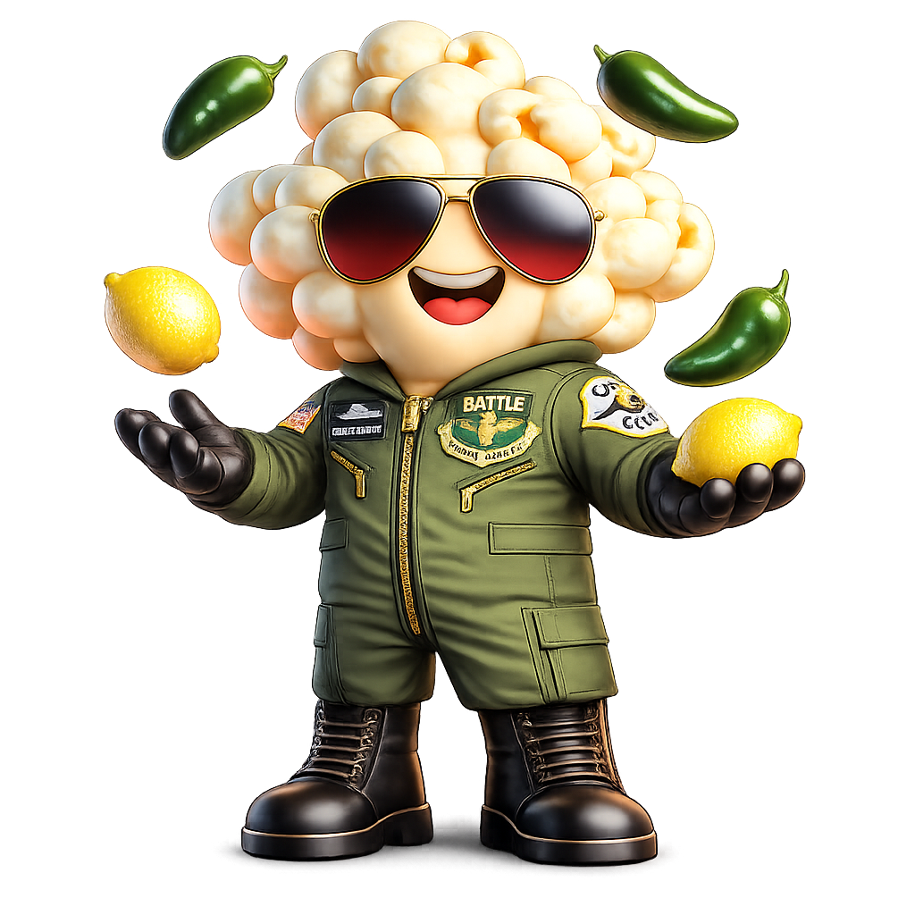
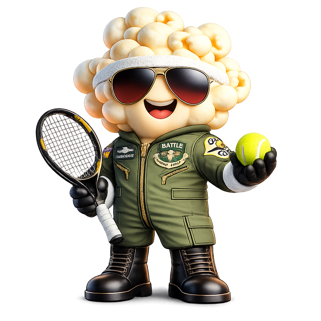
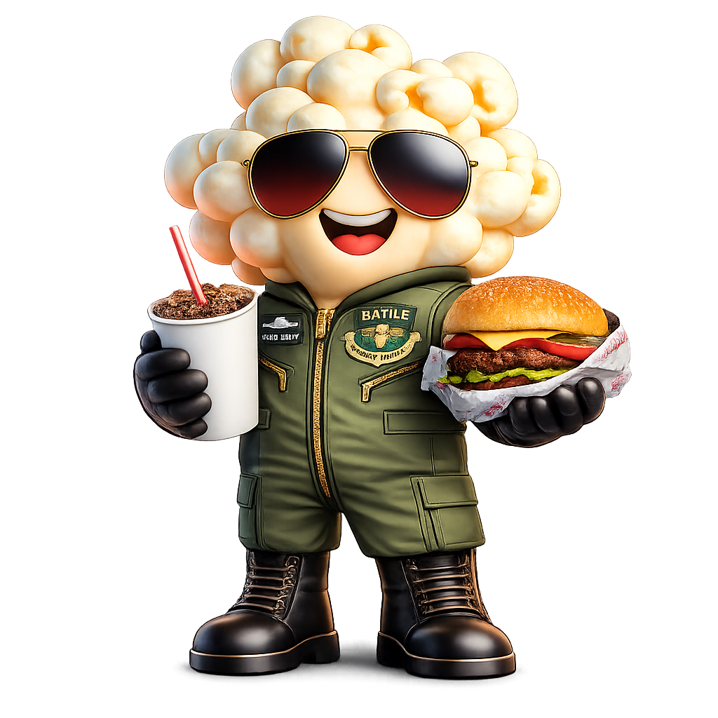
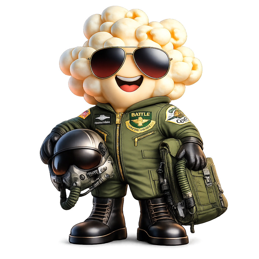
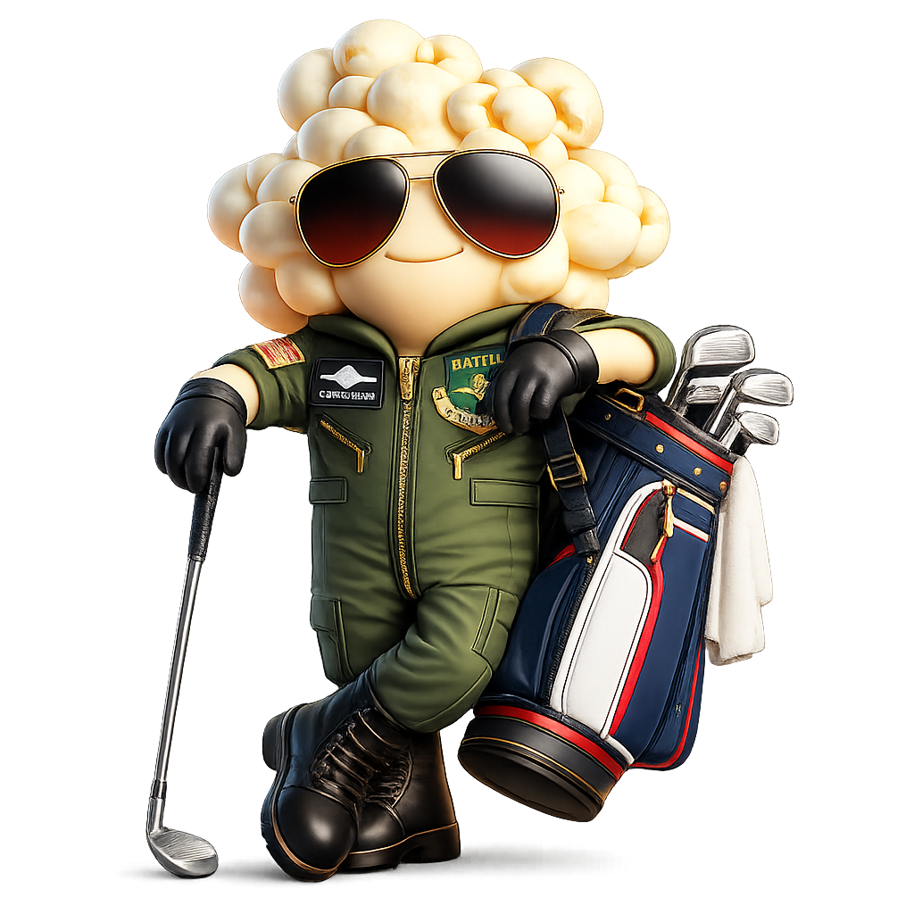
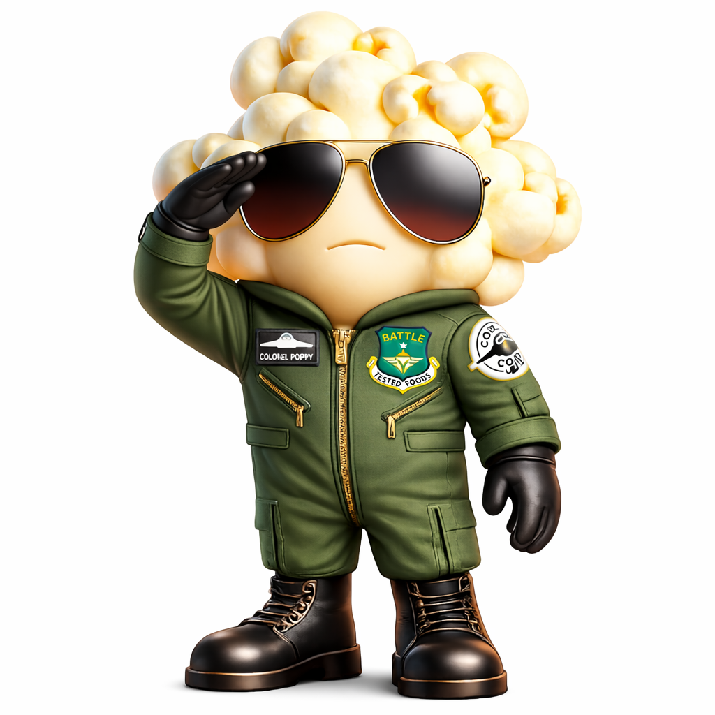
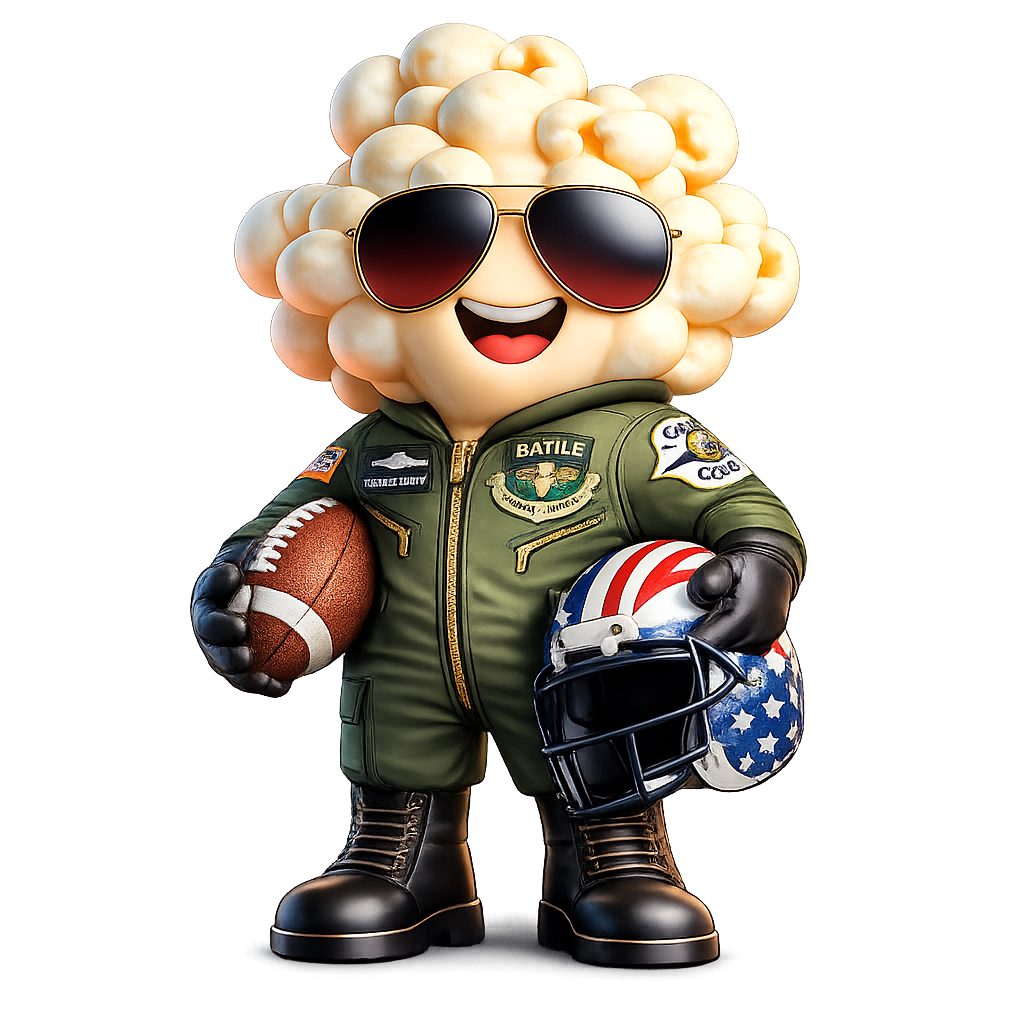
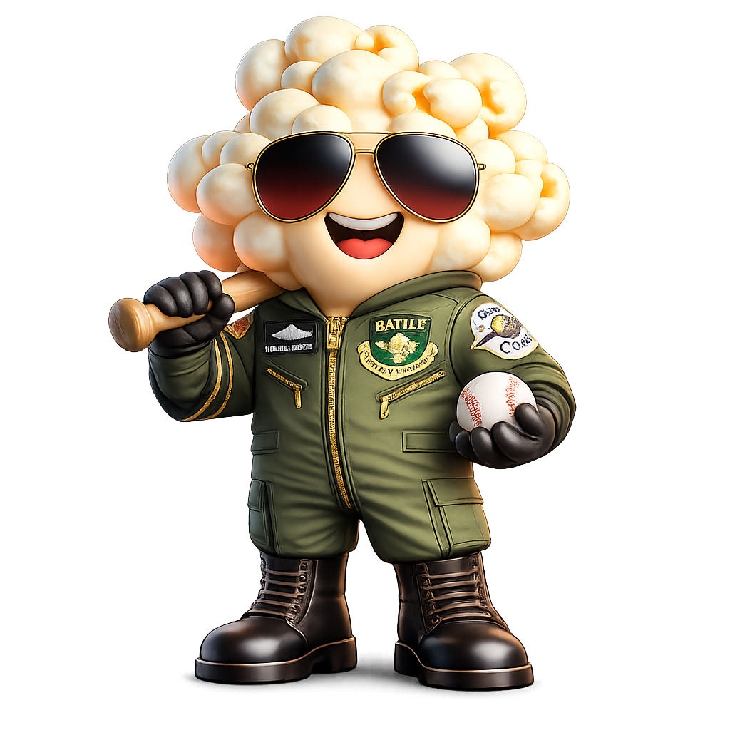
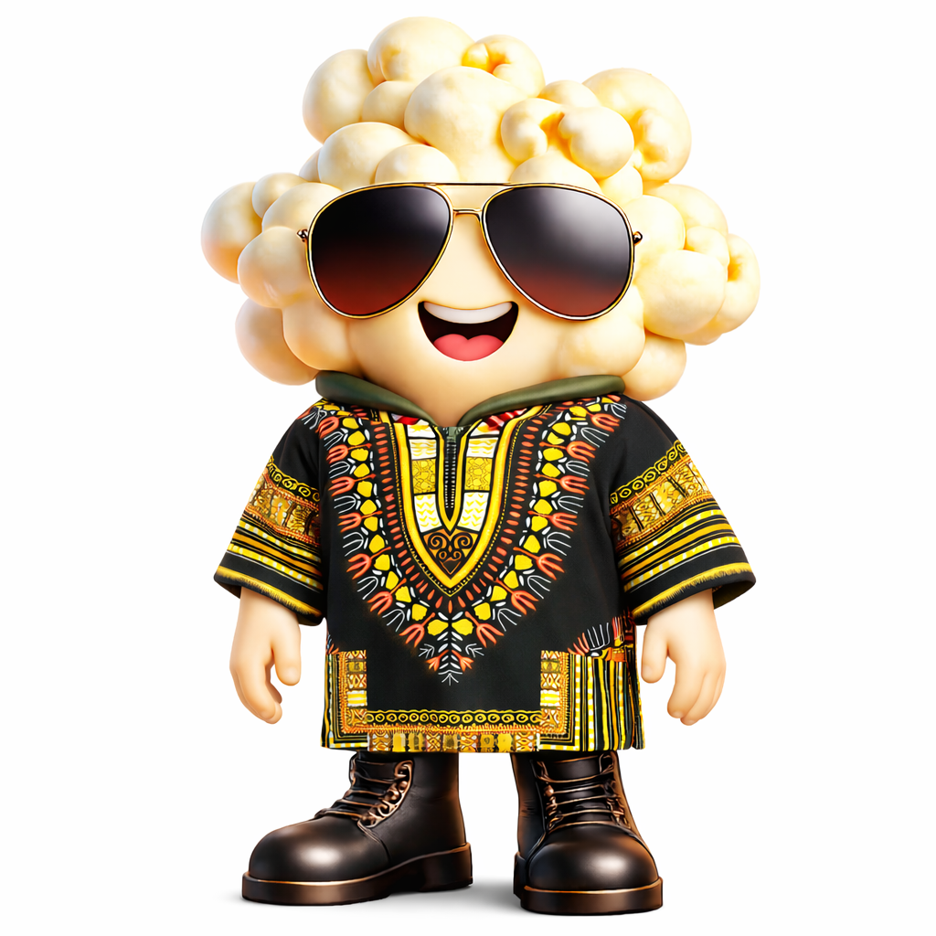
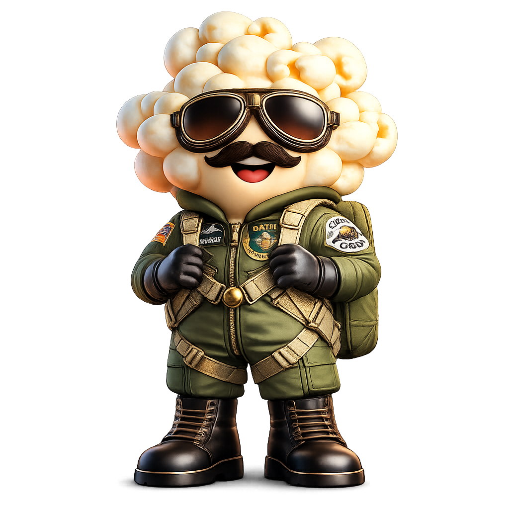
“Poppy” is an original character created by Melanie Kronemann.
All character designs, illustrations, poses, and derivative works are protected under copyright law. Unauthorized use, reproduction, or distribution is prohibited.
All character designs, illustrations, poses, and derivative works are protected under copyright law. Unauthorized use, reproduction, or distribution is prohibited.
© 2026 Melanie Kronemann. All rights reserved.